Photography for olive mills and extra virgin producers
Extra virgin olive oil has a problem no other food product has: what makes it special is invisible. The colour is deliberately screened by dark glass, the aroma cannot be photographed, and on the shelf the difference between a four-euro oil and a twenty-euro one comes down to a label and a photograph. With oil the image does not accompany the product: it makes the claim.
The colour of the oil is a fact, not a preference
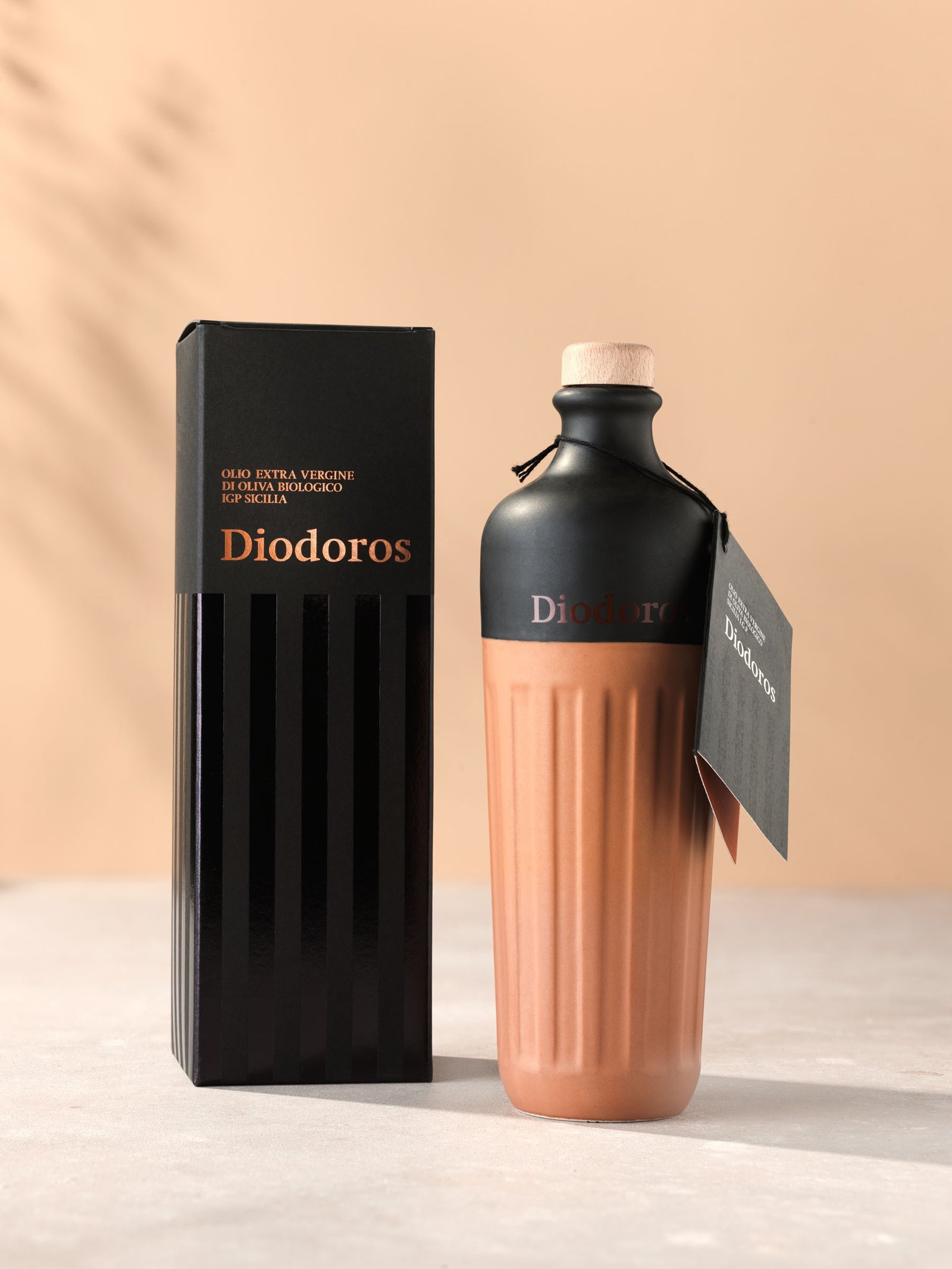
The green of an extra virgin is among the first things a buyer compares, and the first thing to go false in a photograph: dark glass, the mixed light of a processing hall, the cast of a shed. It is held with a colour reference taken on site and a check of the file against the real sample, so that what is seen online and what is held in the hand agree.
Dark glass reflects more than clear glass
A dark bottle is unforgiving: it gives back half the room in one long reflection, and the label has to stay flat and legible on a surface that is close to a mirror. Tins are the twin problem in reverse — printed tinplate scratches, dents and throws hard highlights — and they have to be made to look precious rather than industrial.
The grove and the mill are the part you are missing
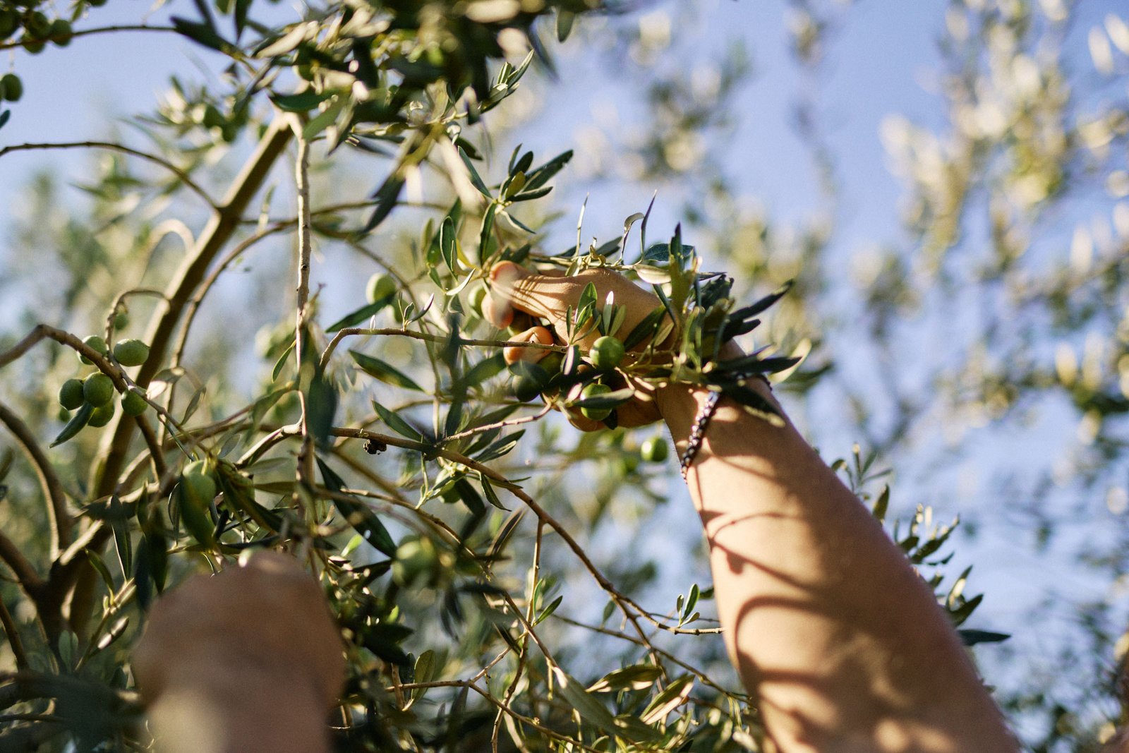
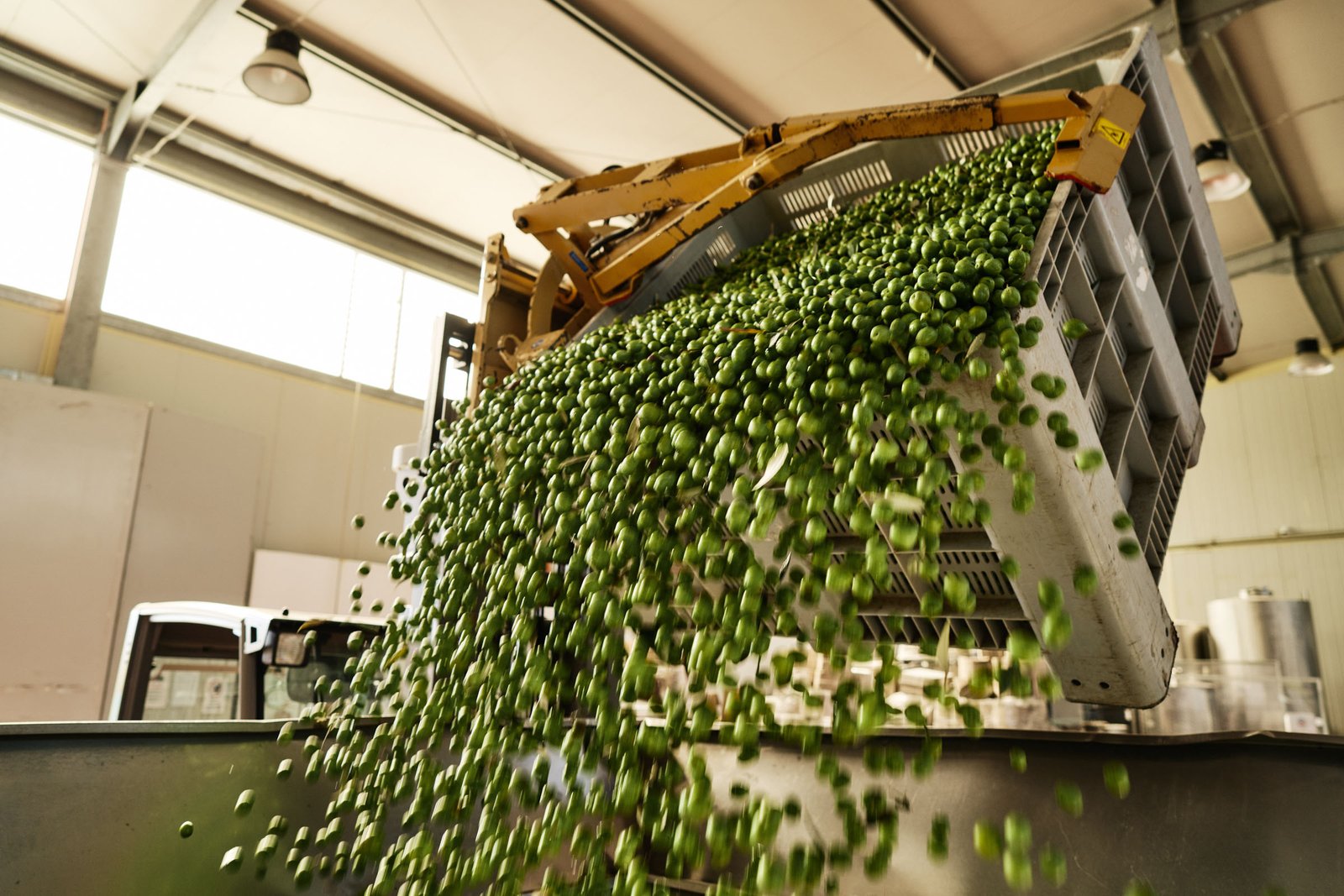
Picking, nets, delivery, washing, malaxing, the first oil coming through. It is the material the institutional pages need, and the importer's sheet, and the sustainability story, and the announcement of the new crop. Almost no mill has it up to date, because it can only be made in those two or three weeks a year.
A harvest is photographed when it happens, not when it suits you
The olive campaign is a narrow window in the year, and in those weeks the company has work to do, not poses to strike. That means building the shoot around your calendar rather than ours, moving inside the rhythm of the work without asking for poses and without stopping the line. It is the only way the images come out true, and it shows.
One image, many formats
E-commerce wants the bottle cut out. The importer wants the label flat and high-resolution for the technical sheet. Retail's digital shelf wants the long format, social wants the vertical, the trade fair wants the big one. Same product, five different files: they are planned into the same set rather than revisited with every request.
Which services
See all services-
Packshot & packaging
The product on its own, the way a buyer sees it: on the product page, on the marketplace, in the price list. The same background and light across the range, colour checked against the real pack.
-
Styled food & recipes
The product on the table, on the plate and in the glass. A set built for that product, styling, recipes: the photograph that shows how what you make gets enjoyed.
-
Advertising & catalogues
Catalogues, campaigns, trade-fair material. A direction agreed before the set, holding from the billboard to the price-list page and from one season to the next.
-
Industrial & factory reportage
Raw material, processing, people at work. The story of how the product is made, for the website, importers, retail buyers and the sustainability report.
Let's talk
Tell us what needs photographing
The more detail you give us, the more precise the quote: how many products, which channels the images are for, and when you need them. We reply within one working day.