Colour decides who you are talking to
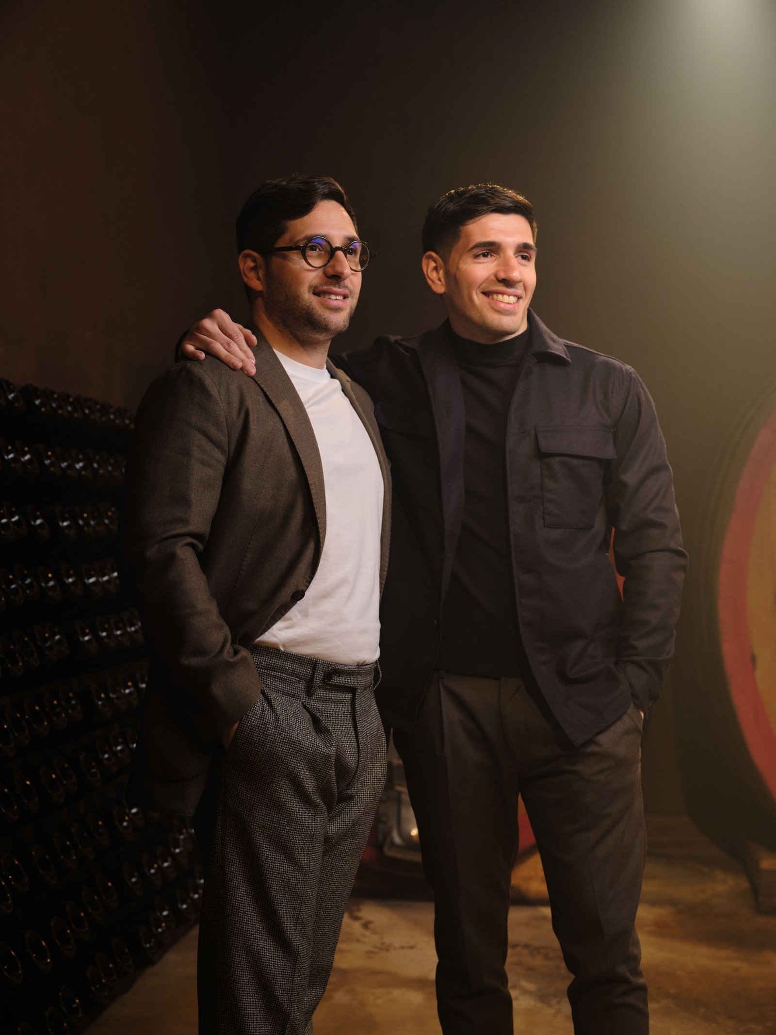
A Sicilian winery. Between 2023 and 2024, several commissions: the catalogue still lifes, the wines and the owners photographed in the cellar, and images for social.
- Project
- Brugnano Wines
- Sector
- Wine & spirits
- Year
- 2023–2024
The brief
Not one job but a run of them. It started with still life for the catalogue: the shots on white, the ones a price list and an e-commerce page need, and alongside them the creative images, the ones that open a section and end up in advertising. Then the other commissions followed — the wines and the owners photographed in the cellar, and the social images — and each time meant stepping back into a visual world already under way.
The constraint
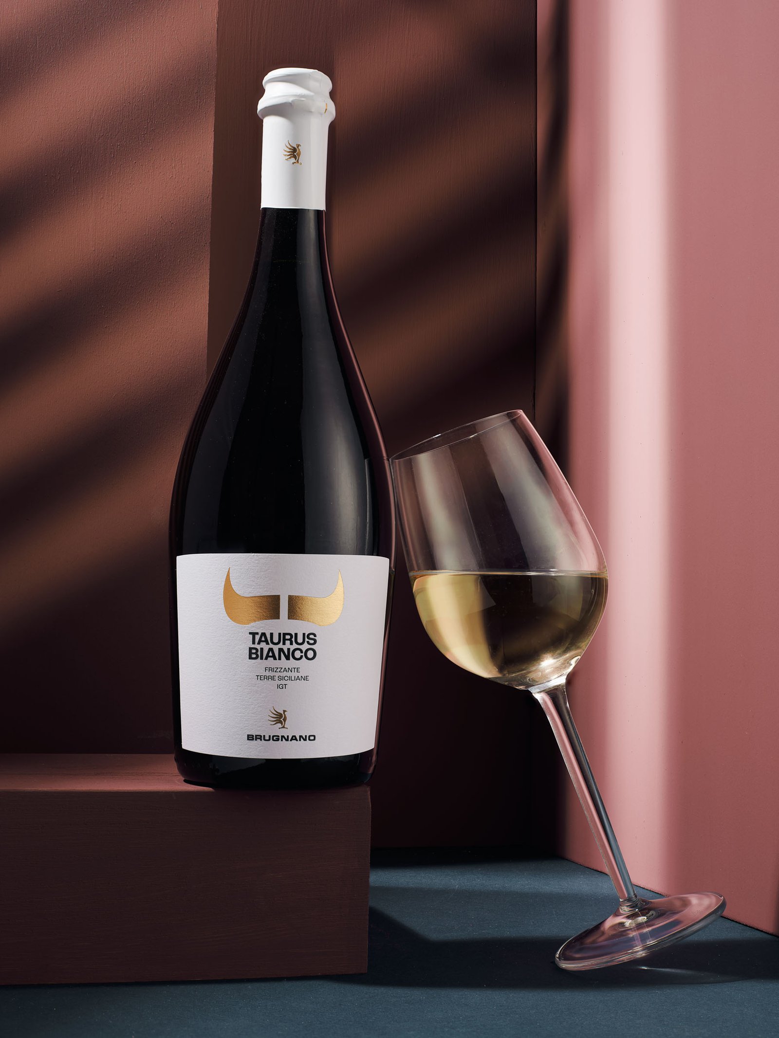
Inside the same catalogue there are wines that are not speaking to the same person. There is the V90 line, aimed at a young audience, and there are more complex labels addressed to people who have been drinking wine for longer. Those are two opposite ways of being looked at: one has to be seen from across a room, among a thousand other things, and stop the eye in a tenth of a second; the other wants to be looked at closely and slowly, and if it raises its voice it disqualifies itself. So the photography is asked to do two contrary jobs — and then both halves land in the same catalogue and on the same website, under the same brand. If they look like they came from two different suppliers, the catalogue splits down the middle.
How we solved it
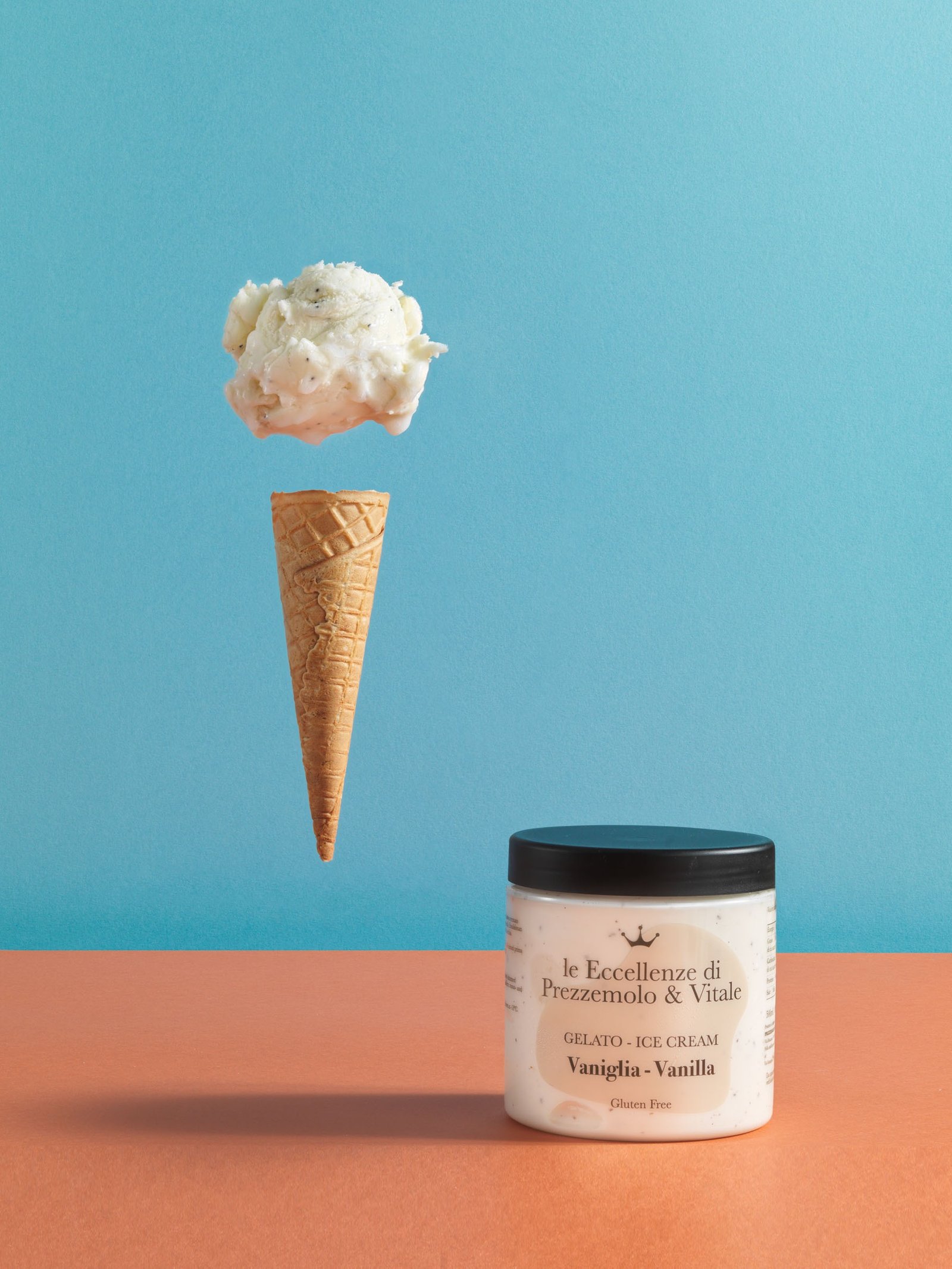
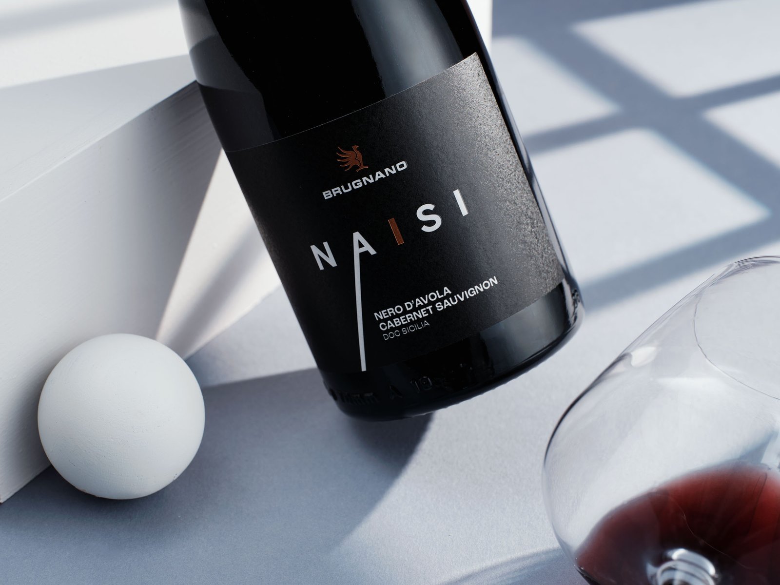
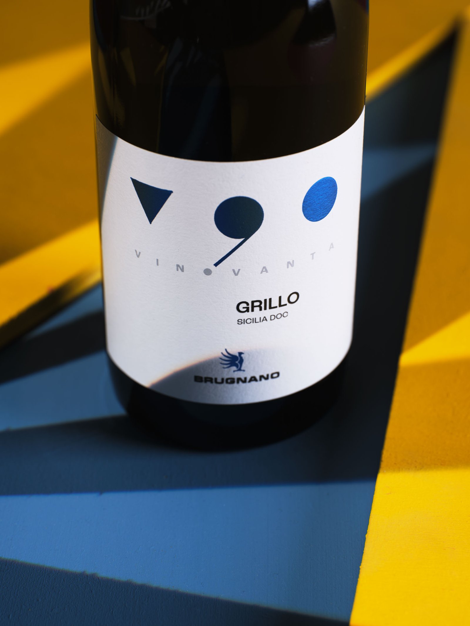
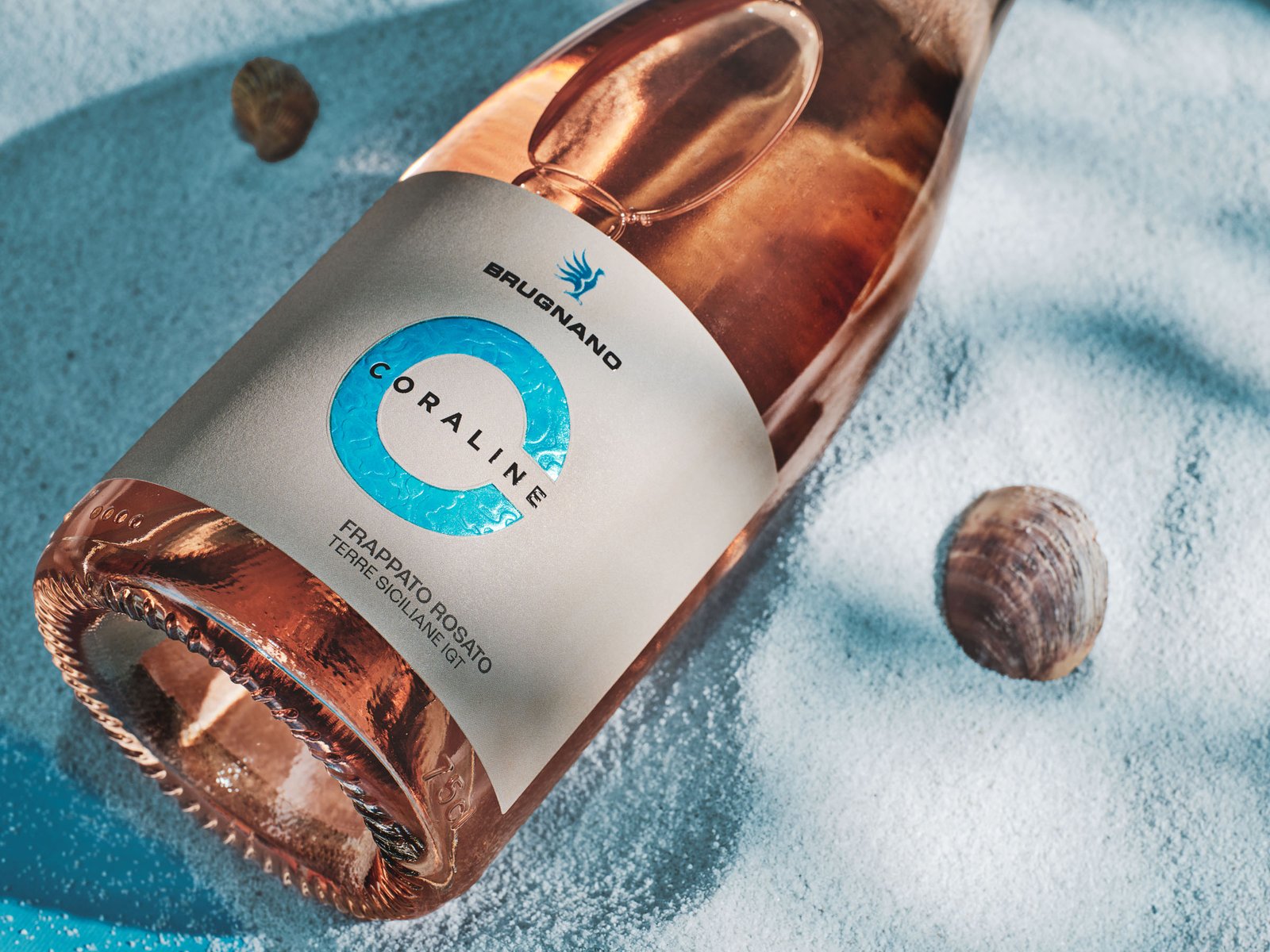
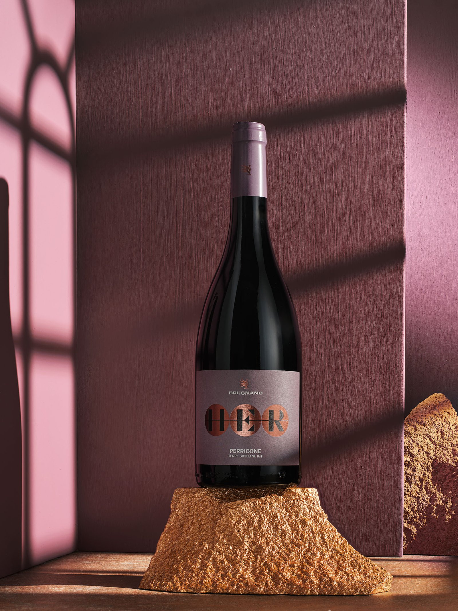
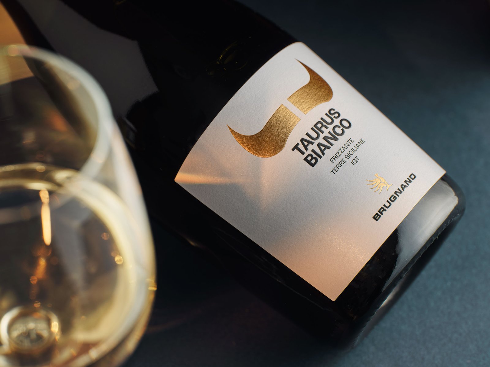
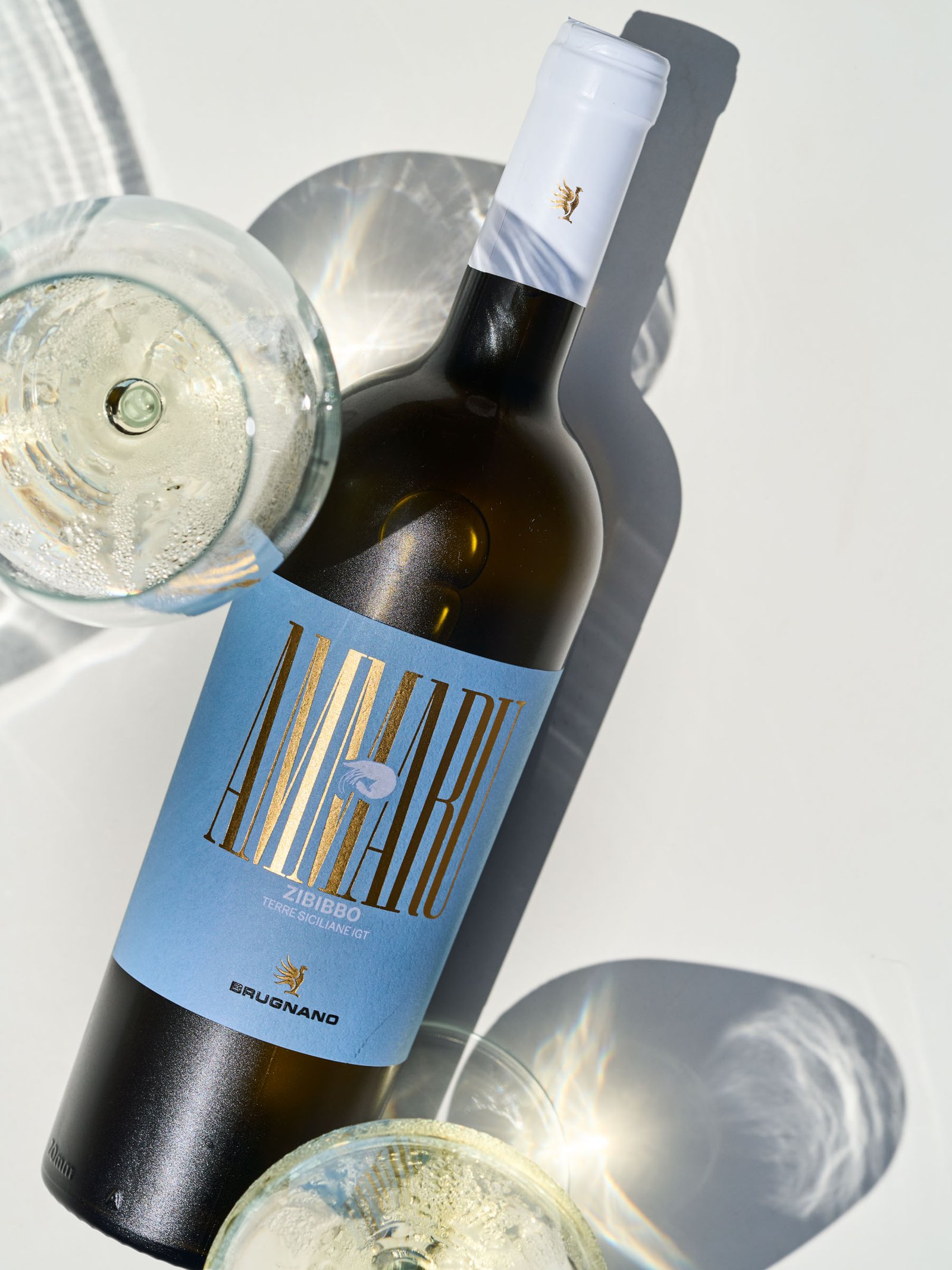
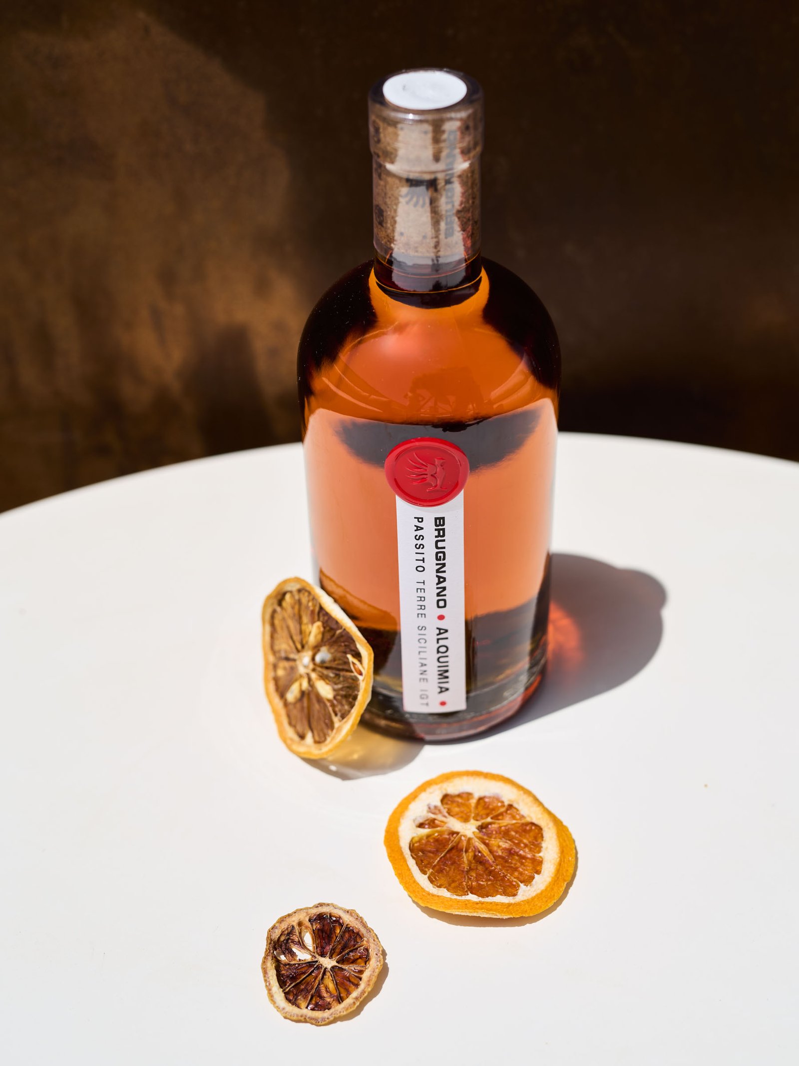
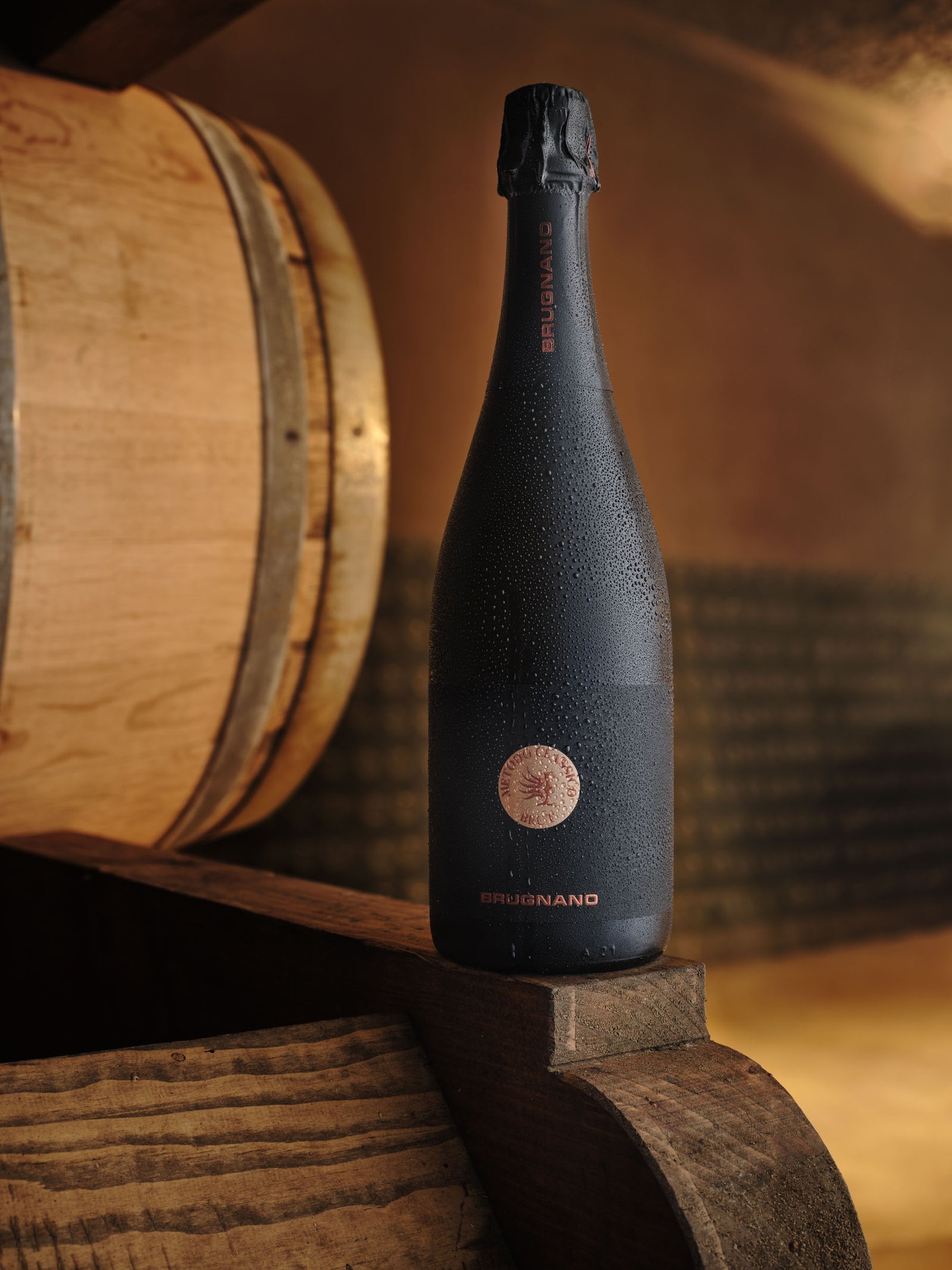
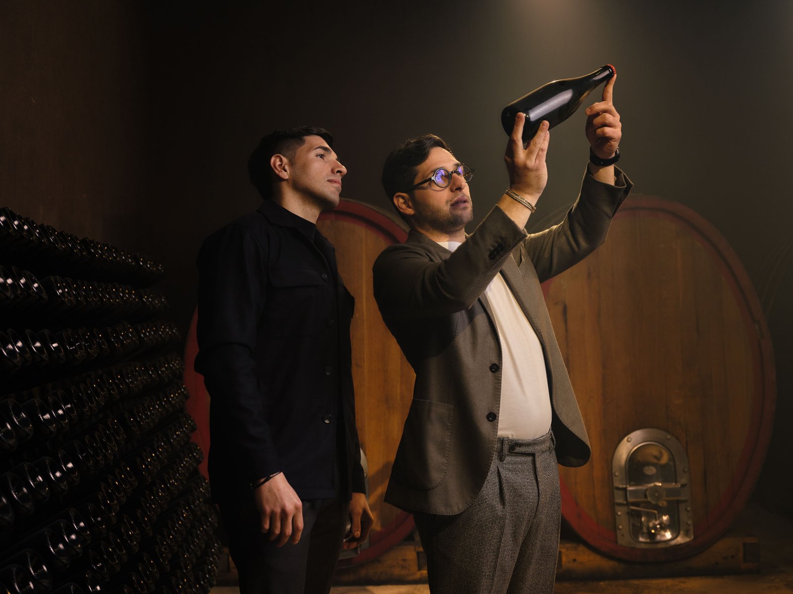
On the line aimed at the young audience we decided to go all the way: full colour, blocks of it cutting across the frame, hard shadows like overhead sun, and the props painted in the same shade as the ground — a field of pink bottles around one real bottle, blue sand, yellow against blue. The set becomes a colour field and the bottle is left as the only object inside it with depth: that is why the eye lands on it, and lands from a distance. On the other half you do exactly the opposite, and it takes more discipline: one wall, a block of tufa stone, the shadow of a window, black on black with a single ellipse of light. What holds the two directions together is not the styling, it is the glass: in both, the real work is the same — giving the bottle volume without returning the set, keeping the label flat and legible, keeping the metallic inks alive without blowing them out, where a few degrees of tilt separate a highlight from a white patch. The brand mark has to read identically over a yellow field and inside a black one. In the cellar the register changes again: light kit to move through a working space, and a light that carves the stacked bottles rather than flattening them.
What we delivered
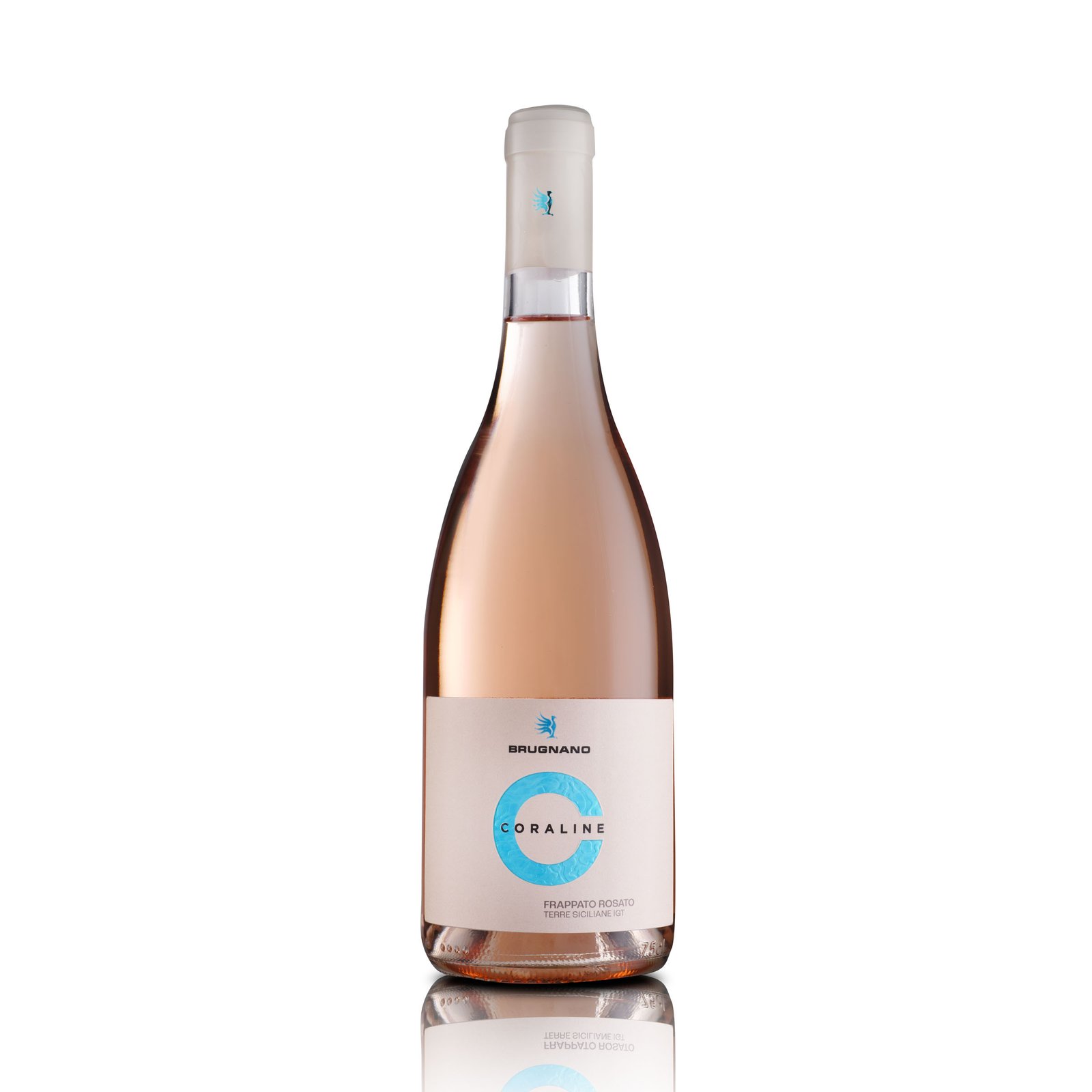
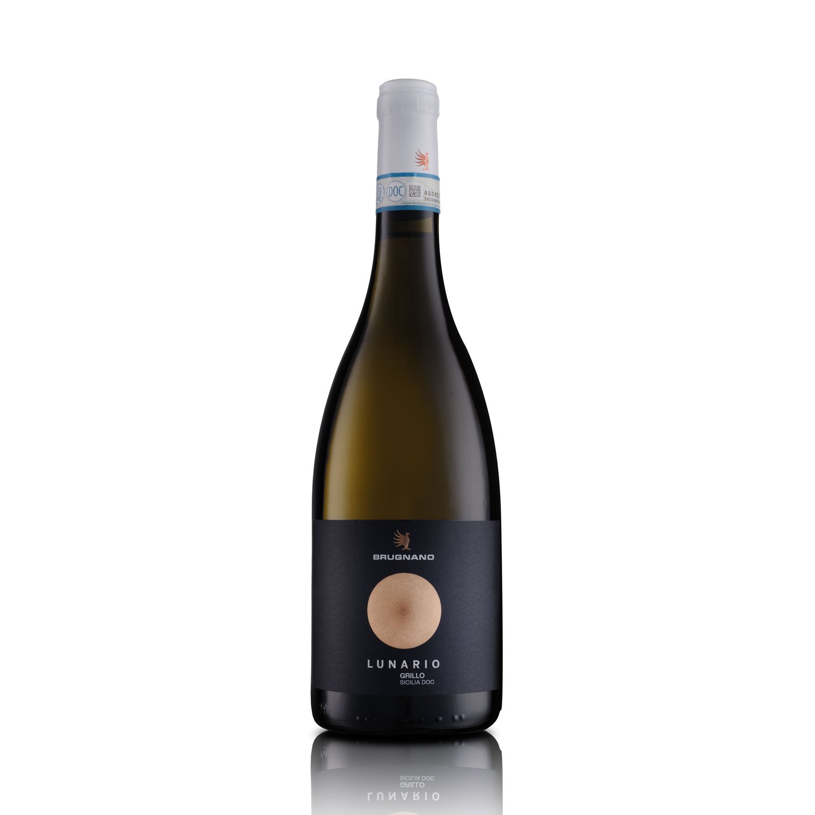
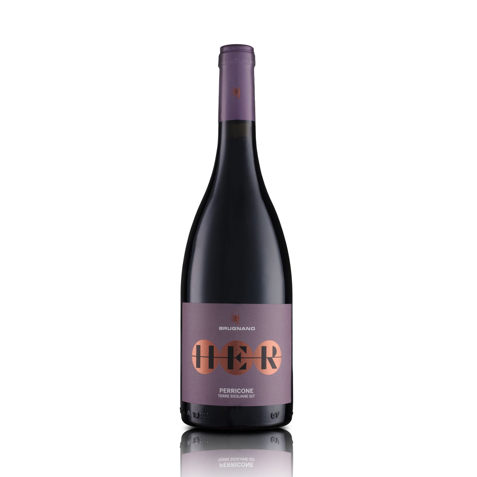
- Still life on white, clippable, for the catalogue and e-commerce
- Creative still life in two directions: full colour for the V90 line, a sober register for the more complex labels
- Cellar shots: the wines among the stacks and the barrels
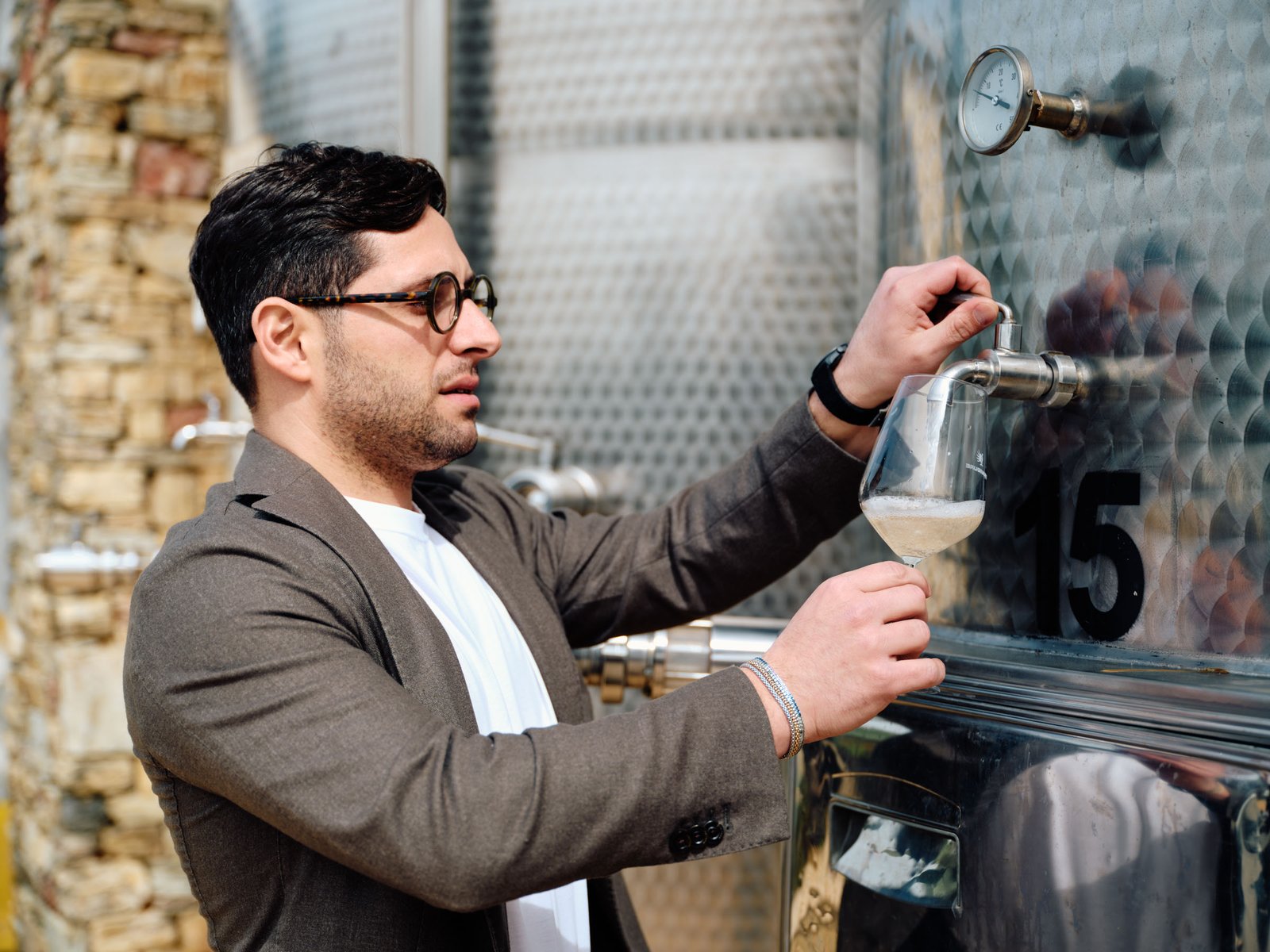
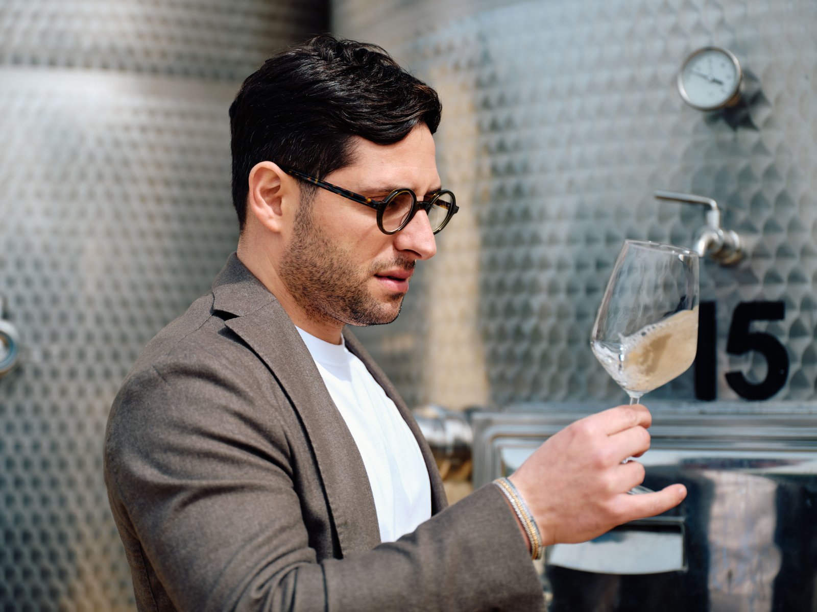
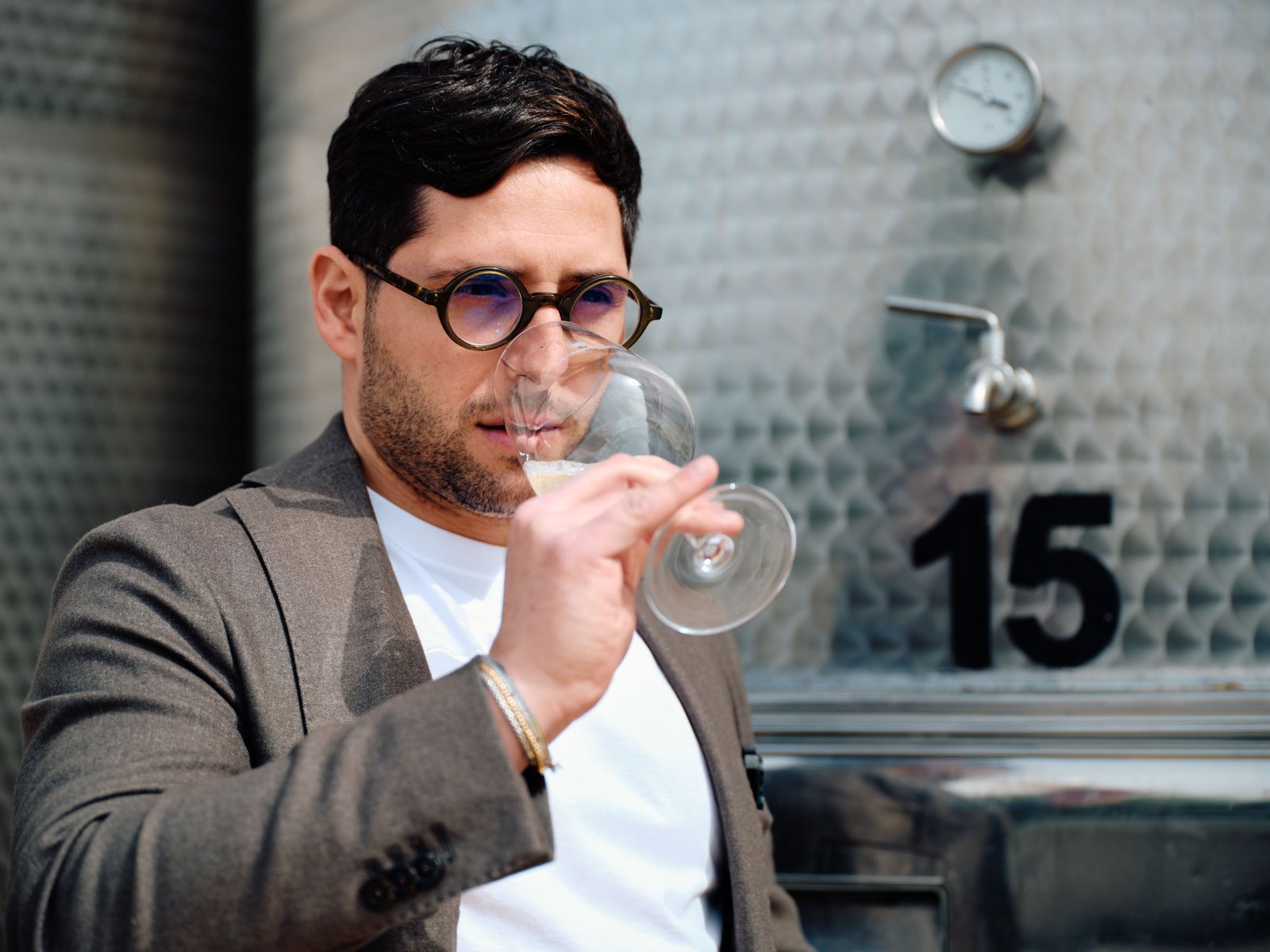
- Portraits of the owners at work, with no posing
- Scene images for social, in portrait format
Where the images ended up
- Product catalogue
- Website
- Social
- Advertising
-
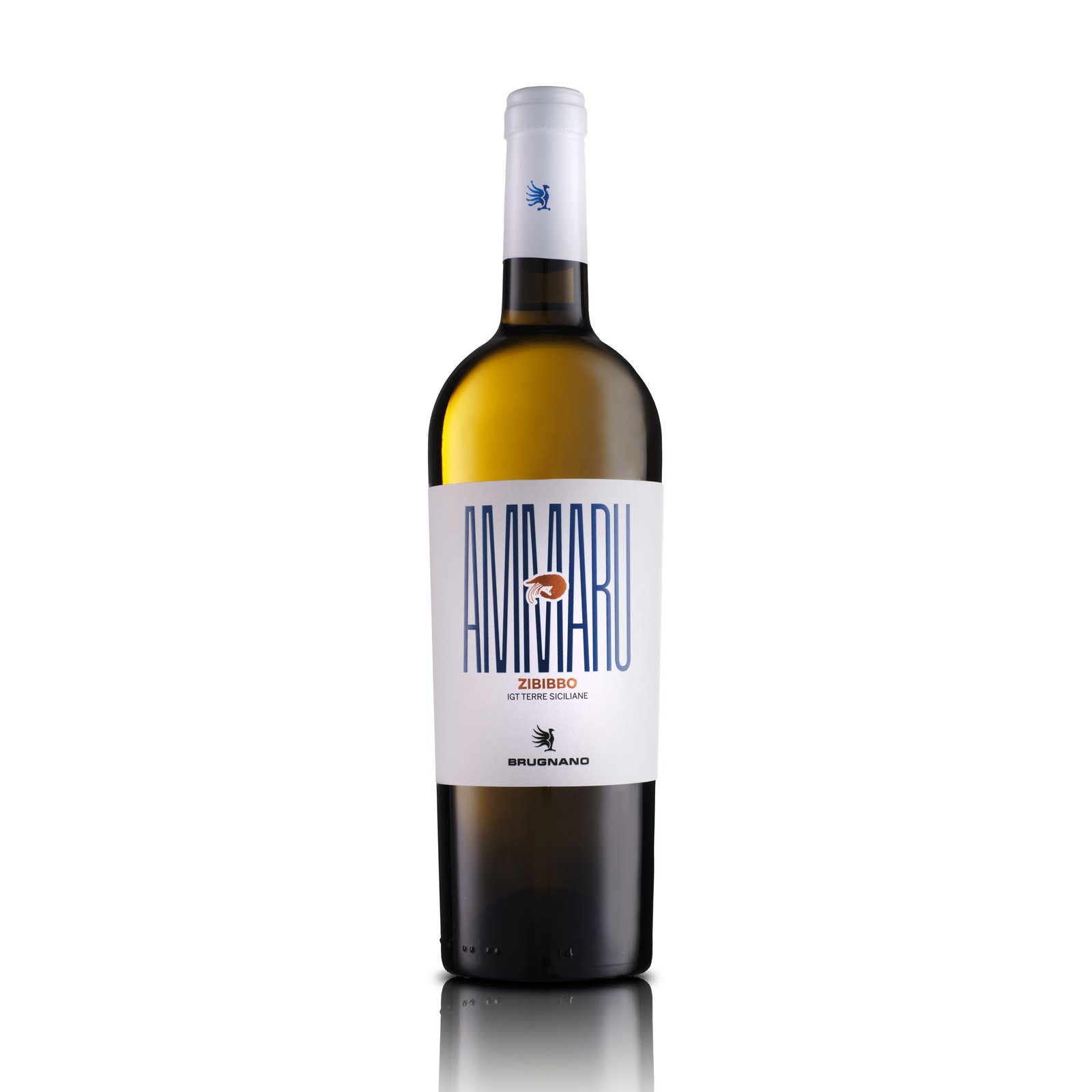
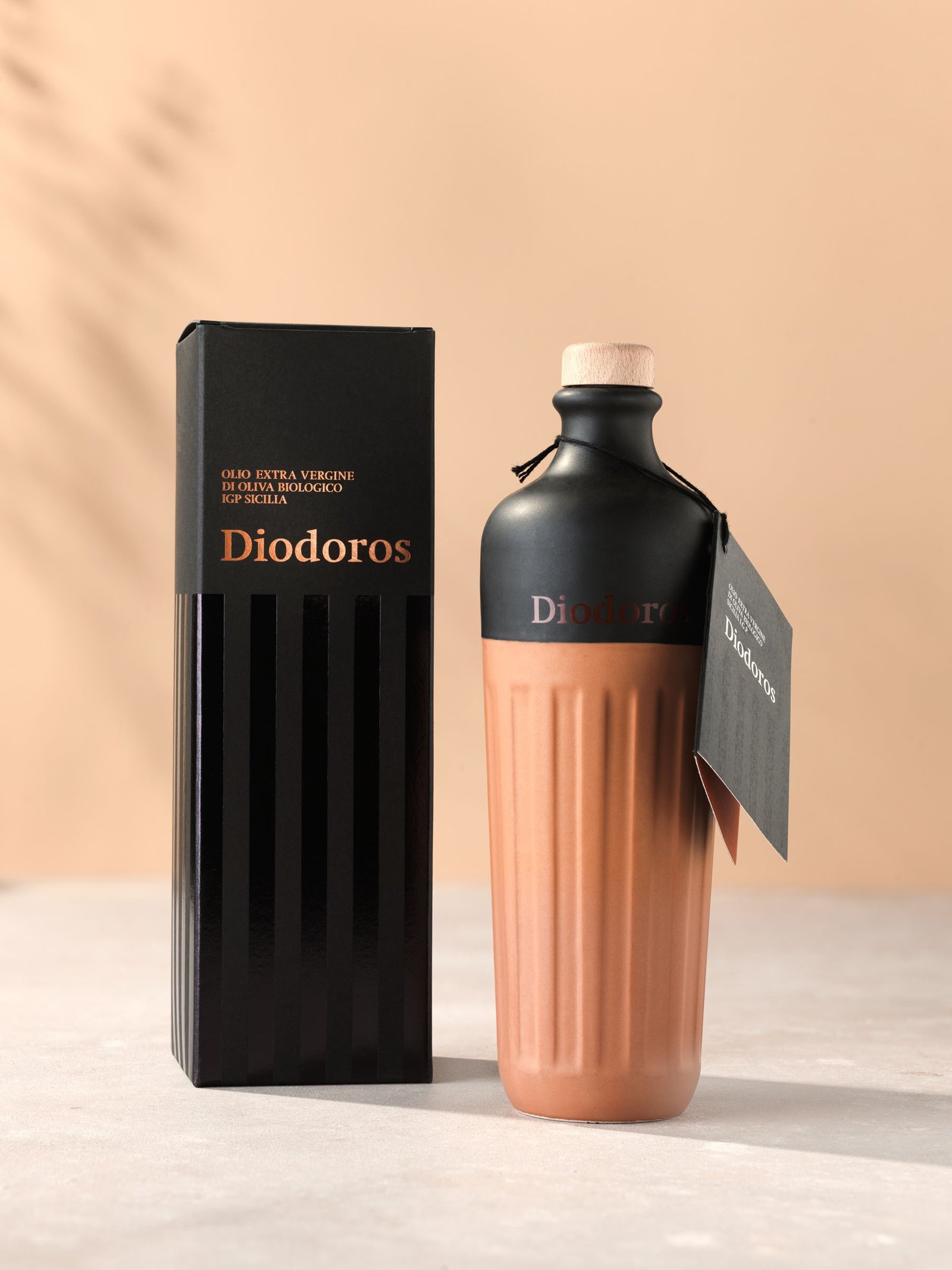
The other half of the same commission is this: product isolated, clippable, with its own shadow. It is the file a price list, an e-commerce page and an importer's sell sheet need, and it must say nothing beyond the product.
-
-
-
-
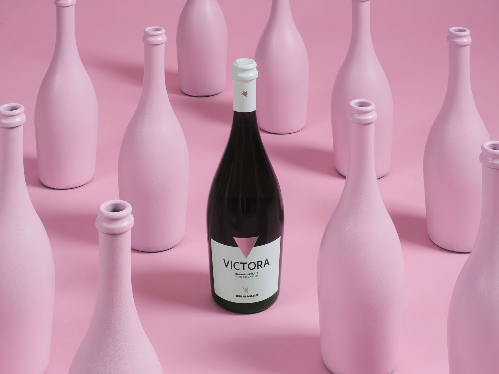
For the line aimed at a young audience we chose to go bold: ground and props painted the same colour, so the bottle is left as the only object with depth inside the colour field.
-
-
-
-
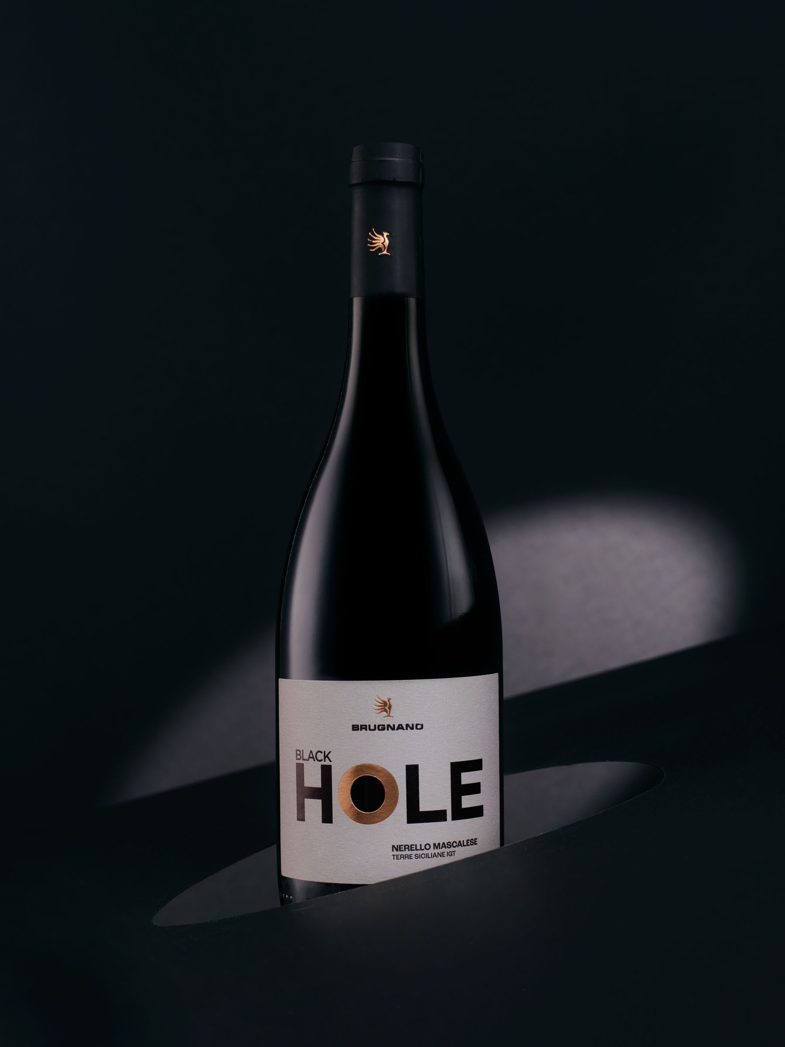
The other direction does the opposite, and it asks for more discipline: black on black, a single ellipse of light. The fewer things in the frame, the more each one weighs.
-
-
-
-
-
-
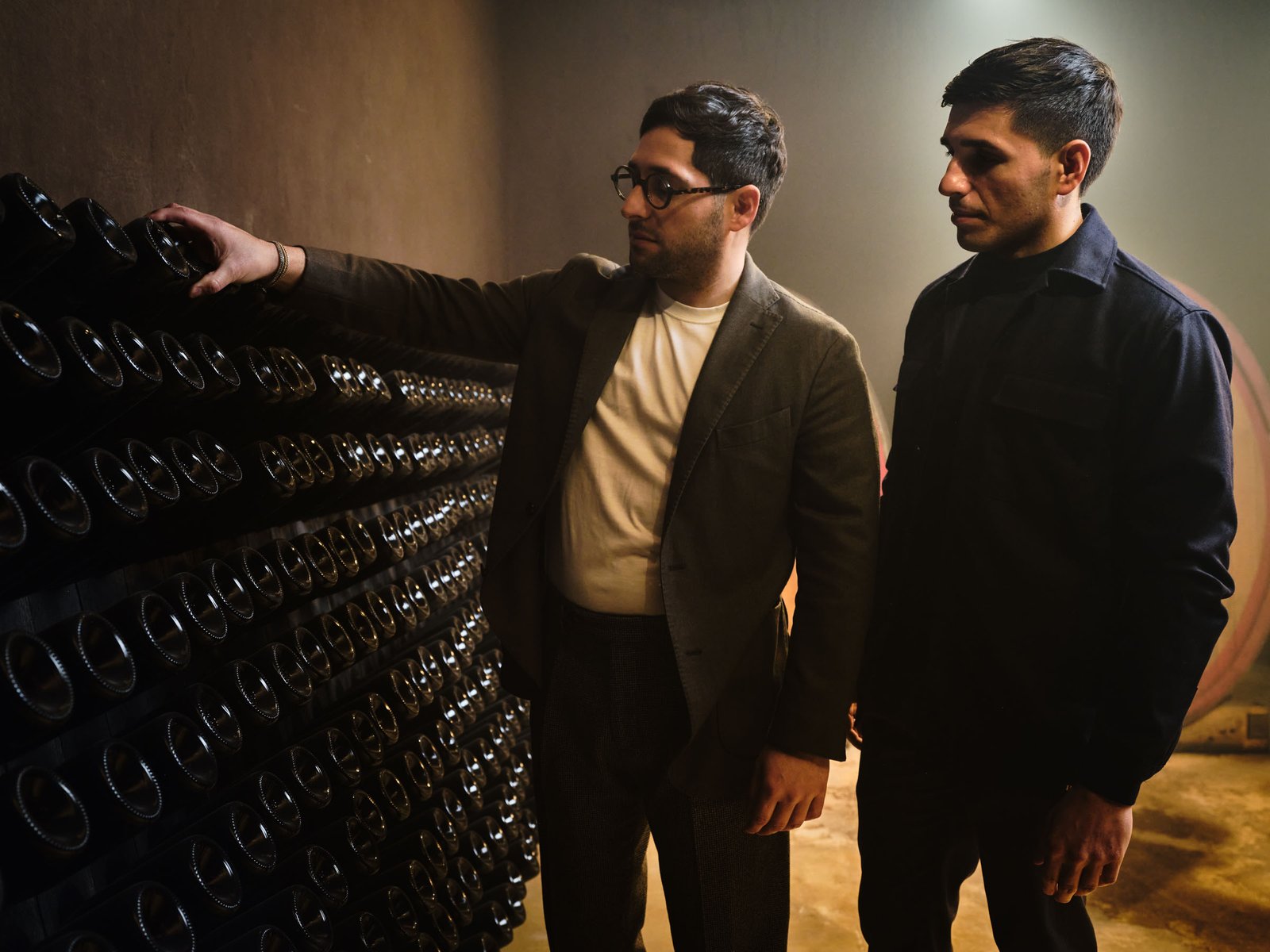
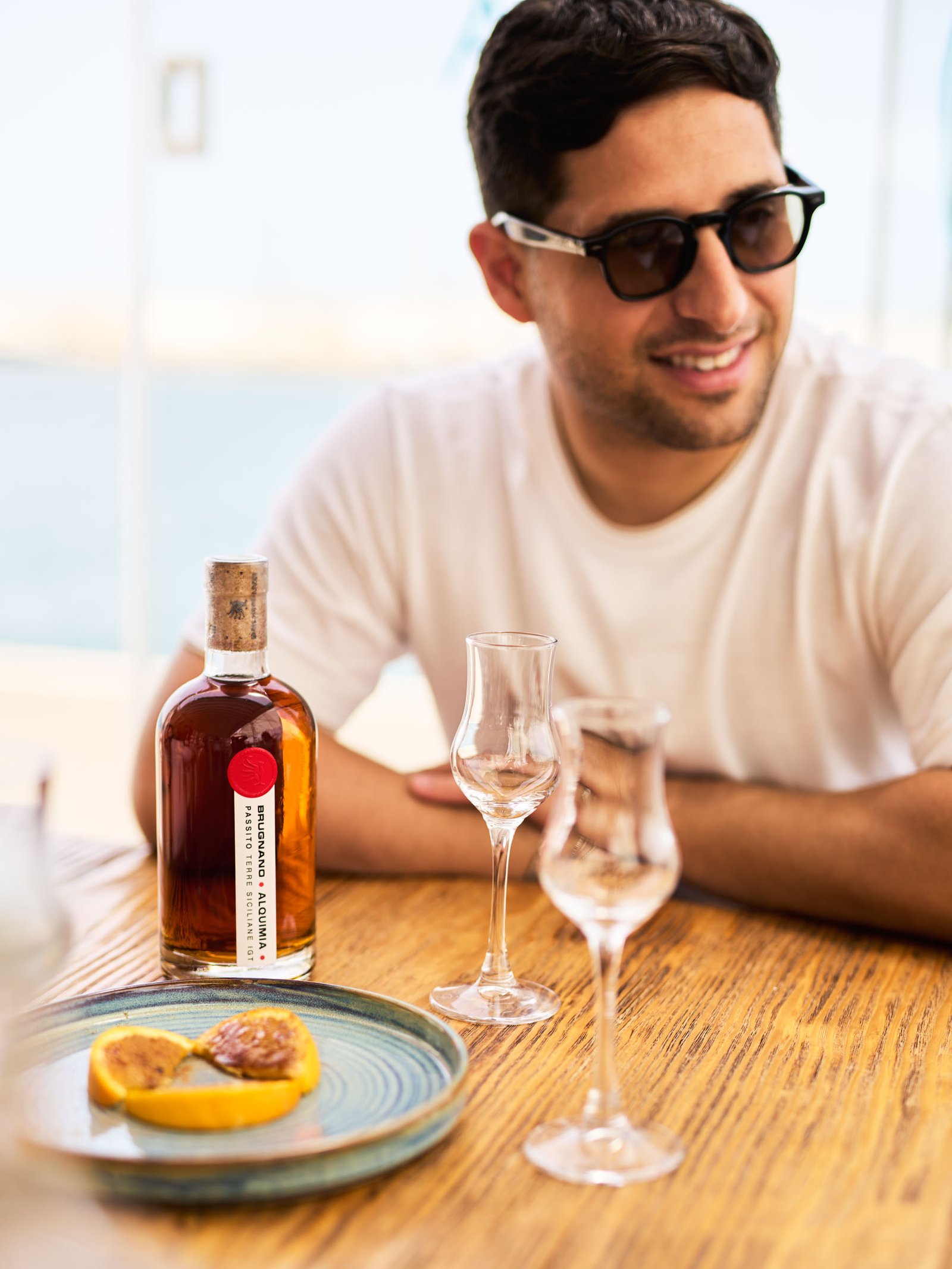
In the cellar everything changes: light kit to move through a working space, and the owners photographed doing something rather than posed.
-
-
-
-
-
-
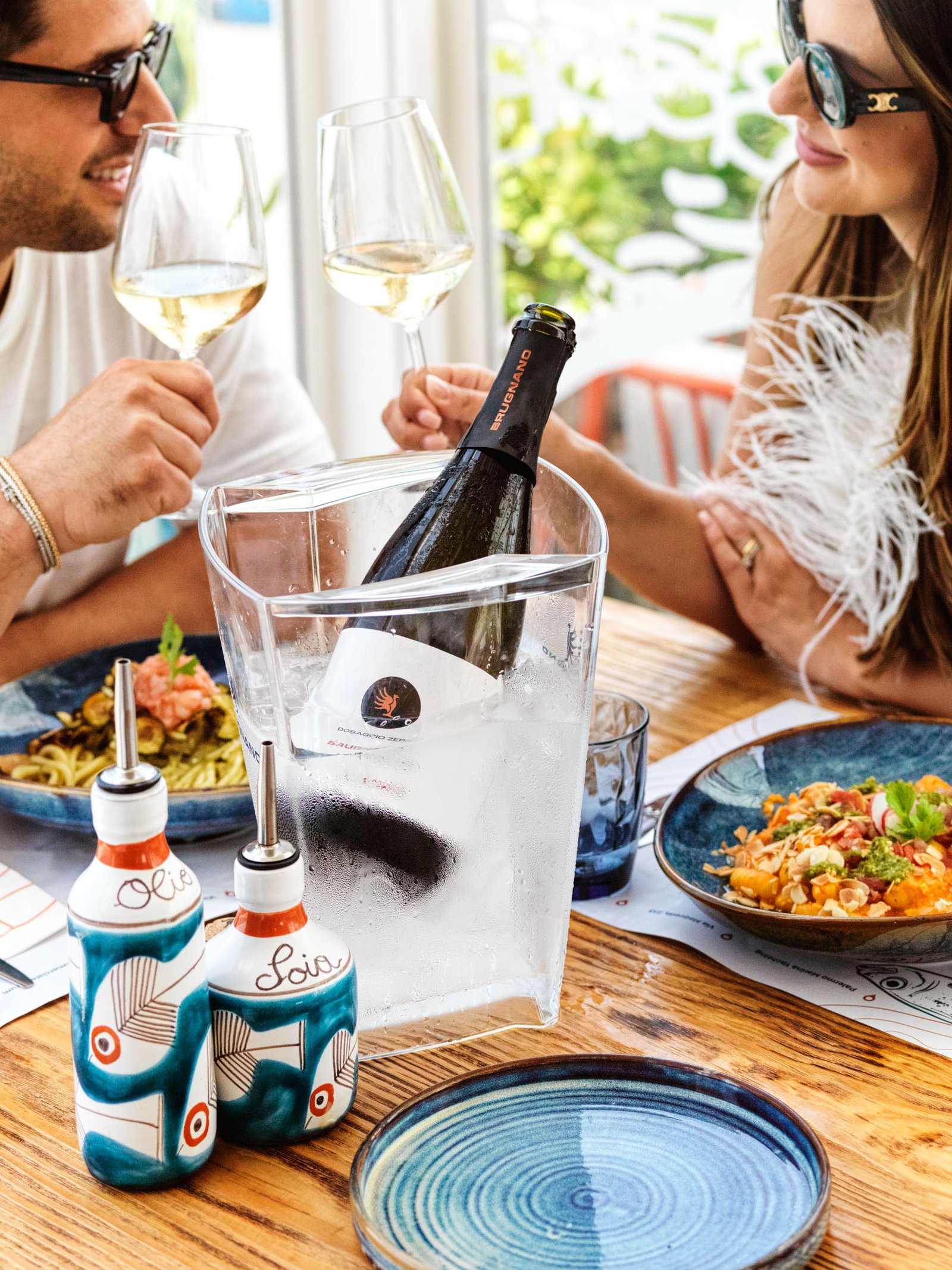
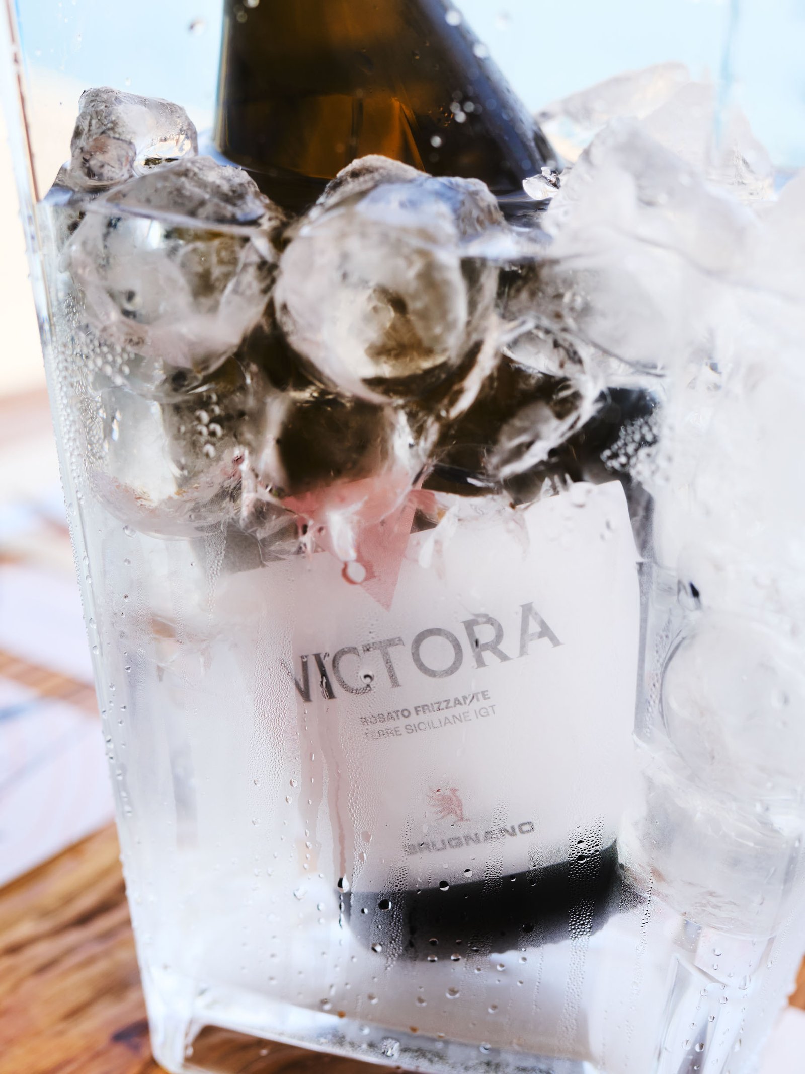
For social the job changes again: the bottle stops being an object and goes back inside a scene — a table, some ice, people. Portrait format, and readable in half a second.
-
-