The jar and what goes into it
Marmalades, jams, spreads and Modica chocolate from Villalba, in the province of Caltanissetta. From 2021 to 2025 we photographed their products for the catalogue, for trade fairs and for the website: the citrus marmalades, the fig and prickly pear jams, the pistachio and hazelnut spreads, the chocolate, the gift boxes.
- Project
- Sicilian Factory
- Sector
- Preserves & sauces
- Year
- 2021–2025
The brief
Five years of photographs for three destinations that ask for different things. The catalogue wants the products recognisable, one after another. The trade fair wants images that read from a distance, in large format, among dozens of other stands. The website wants files that hold up on a phone as well as on a big screen. And the range is not a single family: marmalades, jams, spreads, chocolate, gift boxes, each with its own jar, its own label, its own colour. It all had to look like the same brand, without all looking the same.
The constraint
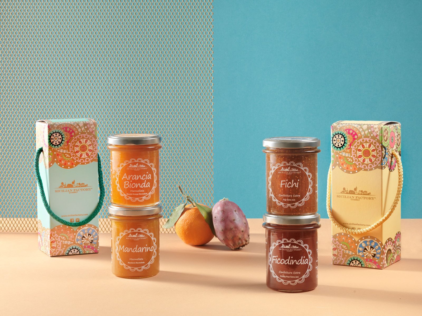
A jar is glass with a metal lid: the glass reflects what is around it and the lid is a mirror, gold on the spreads and silver on the marmalades. On top of that, Sicilian Factory's marmalade and jam labels are a white drawing printed on clear film, a piece of lace, and the product shows through: on the fig jam you can count the seeds through the label. The colour of the pack is the colour of the marmalade. It is a beautiful choice and an unforgiving one in a photograph, because if the colour shifts even slightly two things go wrong at once, the product and the label. And the white of the drawing has to stay crisp on the glass, wherever the light comes from.
How we solved it
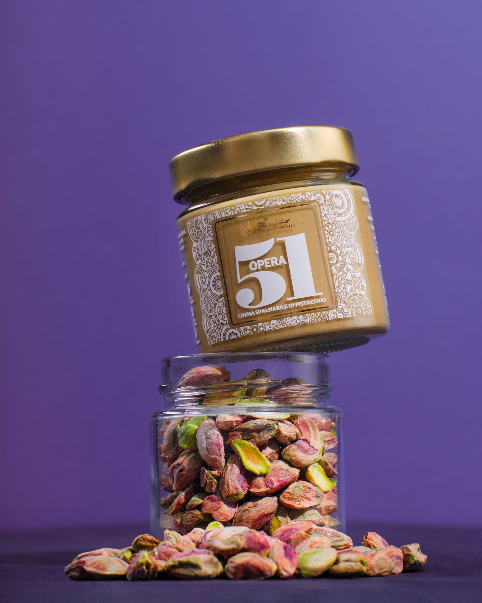
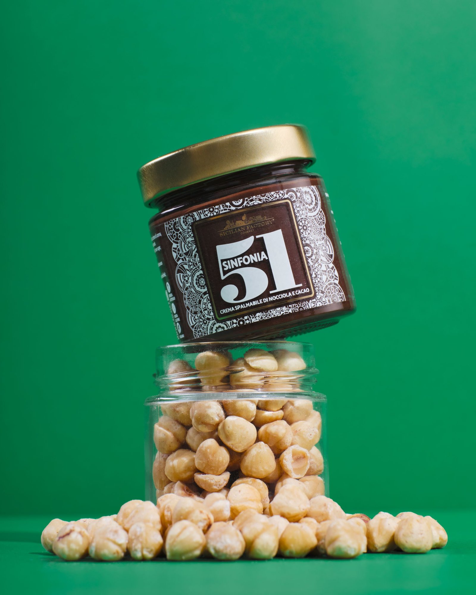
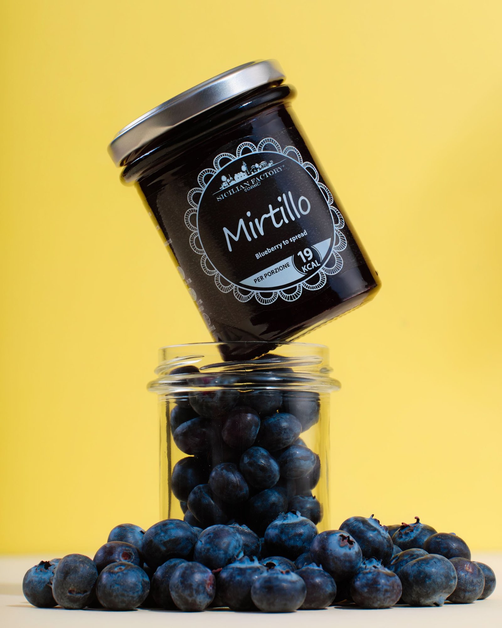
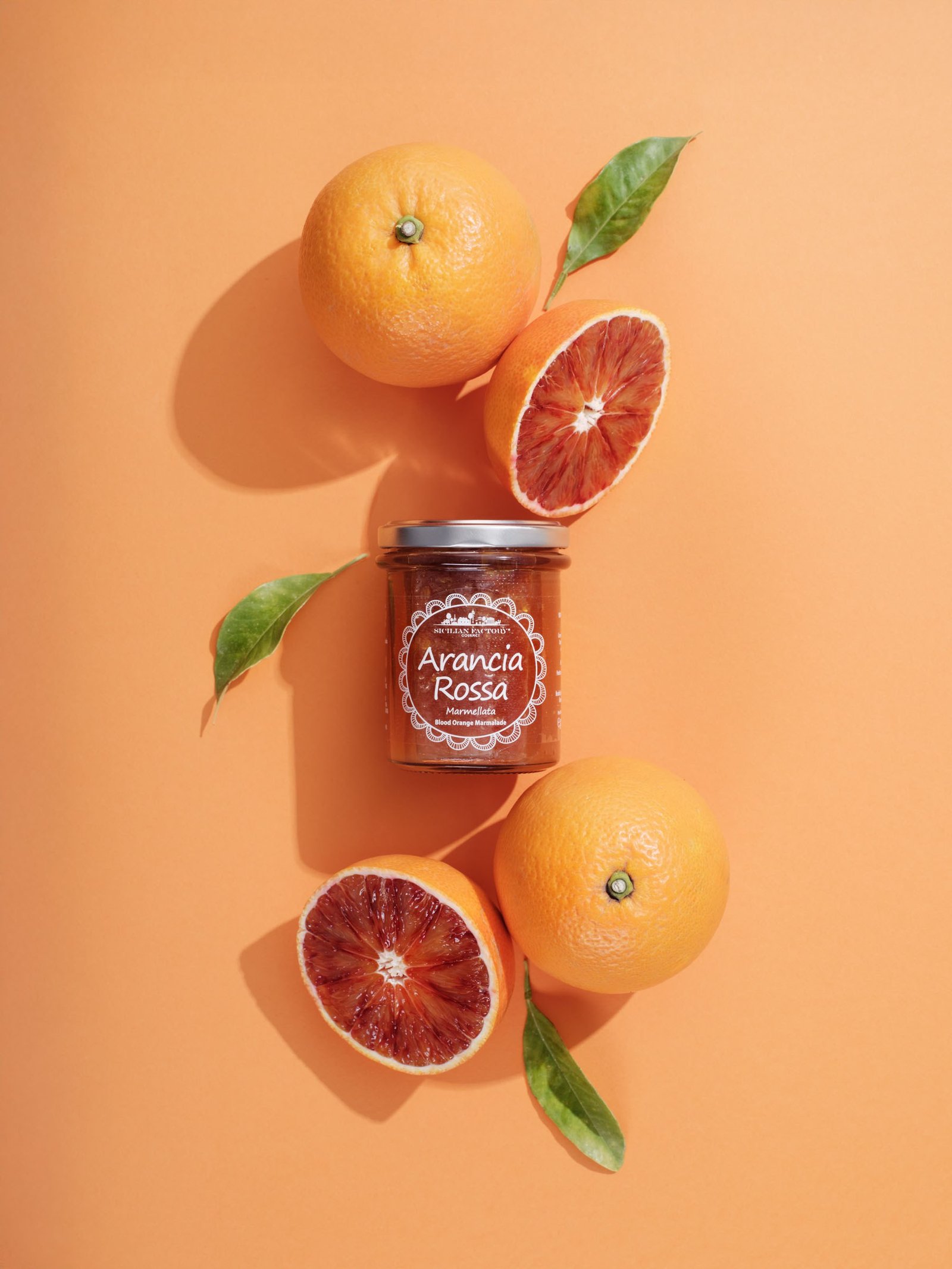
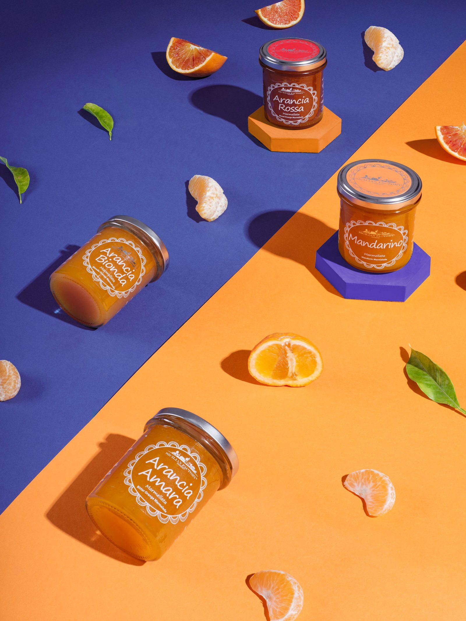
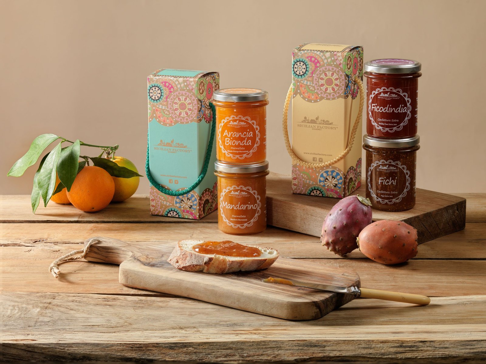
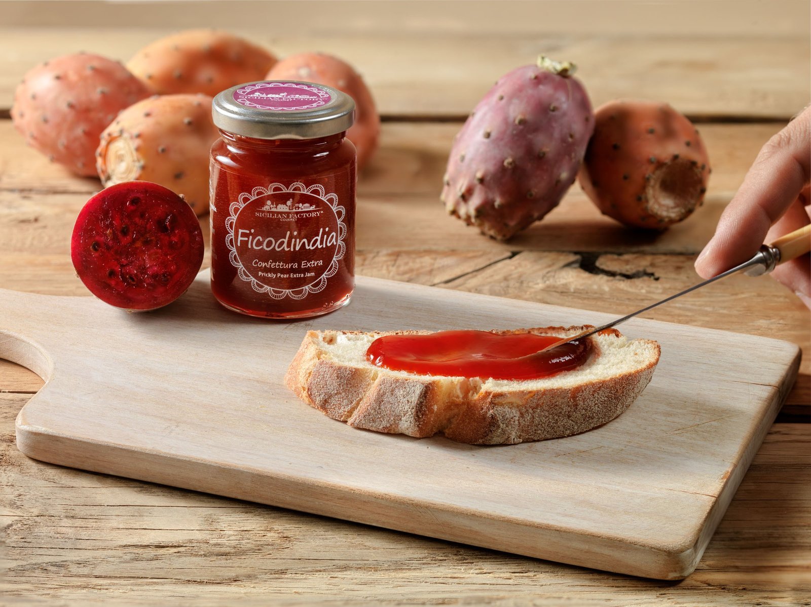
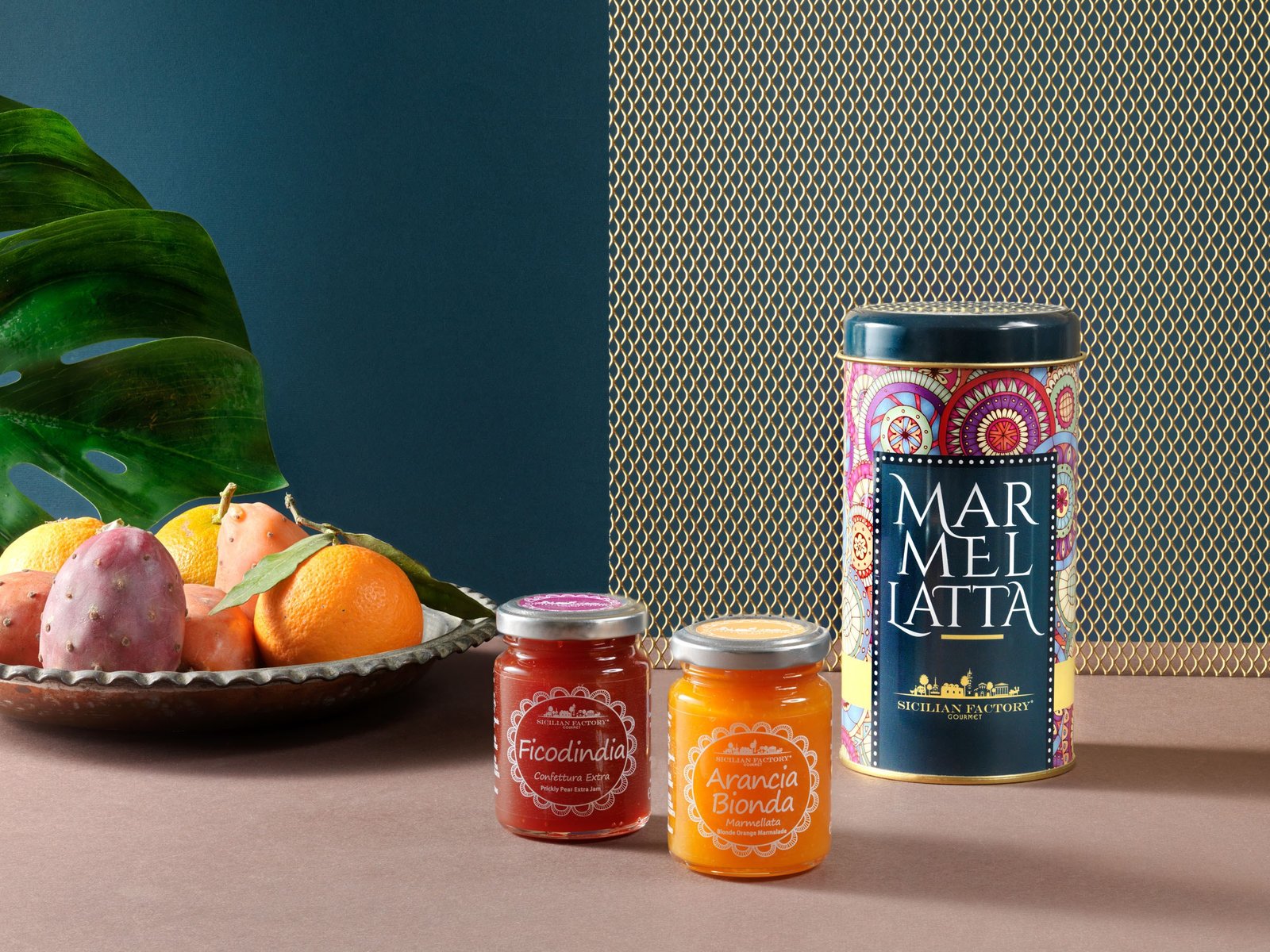
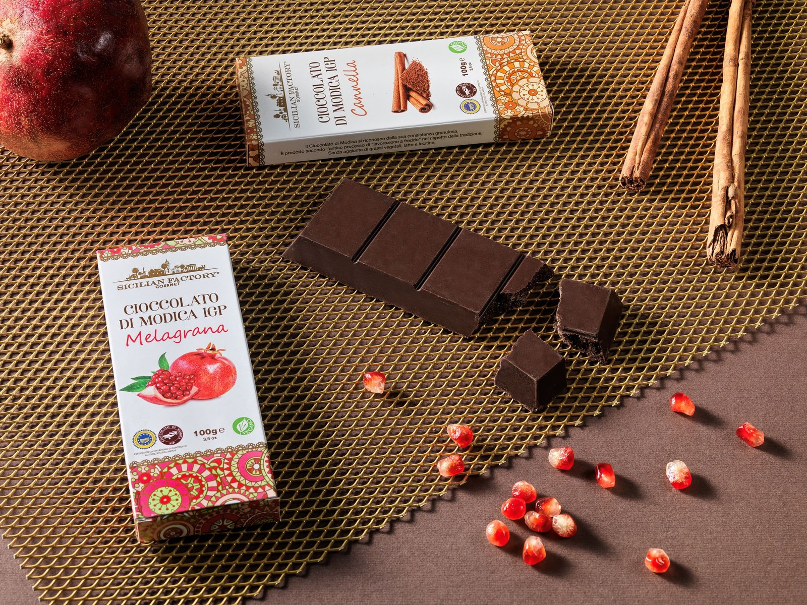
There is no single set: there are four registers, and one rule holding them together. For the spreads and the blueberry, the jar balances on top of a glass jar full of what it is made from — pistachios, hazelnuts, blueberries — spilling onto the surface, against a solid background chosen to make the product stand out: violet for pistachio, green for hazelnut and cocoa, yellow for blueberry. For the citrus, hard light like sunshine, long shadows and coloured paper: the blood orange cut open on orange, four marmalades on a field split between blue and orange. For the gift boxes, the tin and the Modica chocolate, solid backgrounds and a gold metal mesh, as dense as the patterns on the packs. And to show how it is eaten, wood, bread and a knife spreading. The rule never changes: beside the product there is almost always what goes into it — oranges, mandarins, prickly pears, pomegranate, cinnamon — and the labels can always be read.
What we delivered
- Spreads and blueberry as a series: the jar balanced on its ingredient, on solid backgrounds
- Citrus marmalades in hard light, from above and in range compositions
- Gift boxes, tins and Modica PGI chocolate
- Table-set images, with bread and the act of spreading
- Portrait and landscape images for the catalogue, trade fairs and the website
Where the images ended up
- Product catalogue
- Trade fairs
- Website