The part that shines
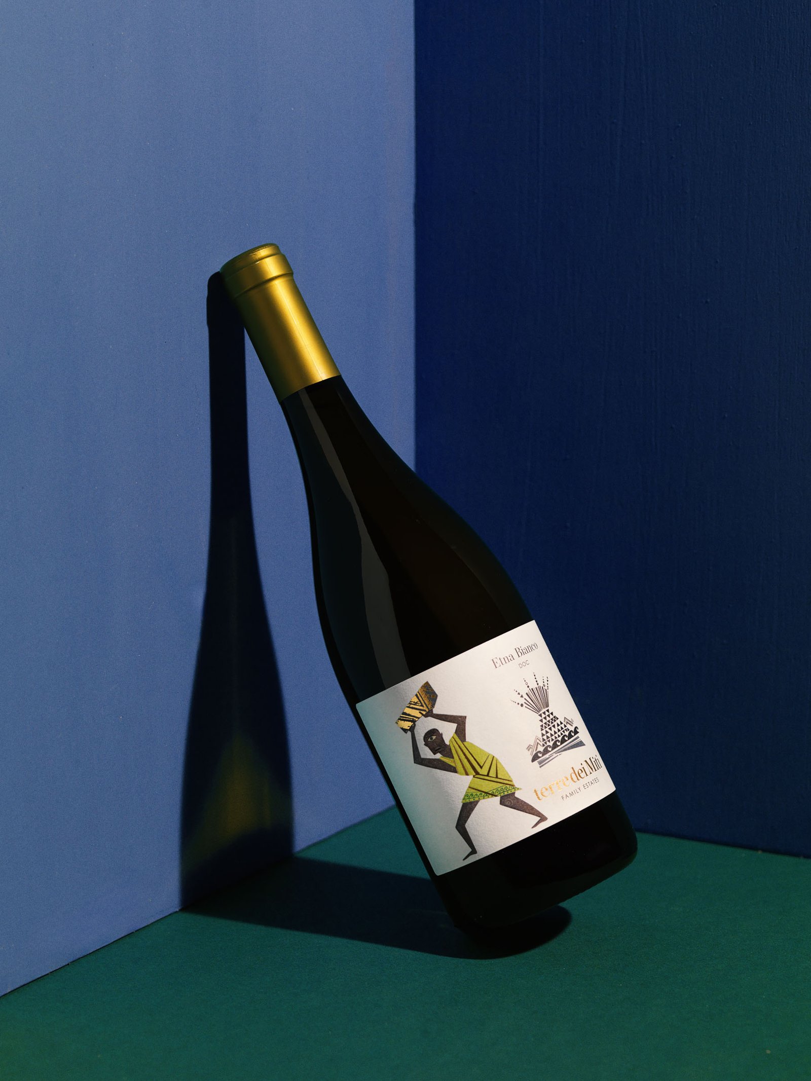
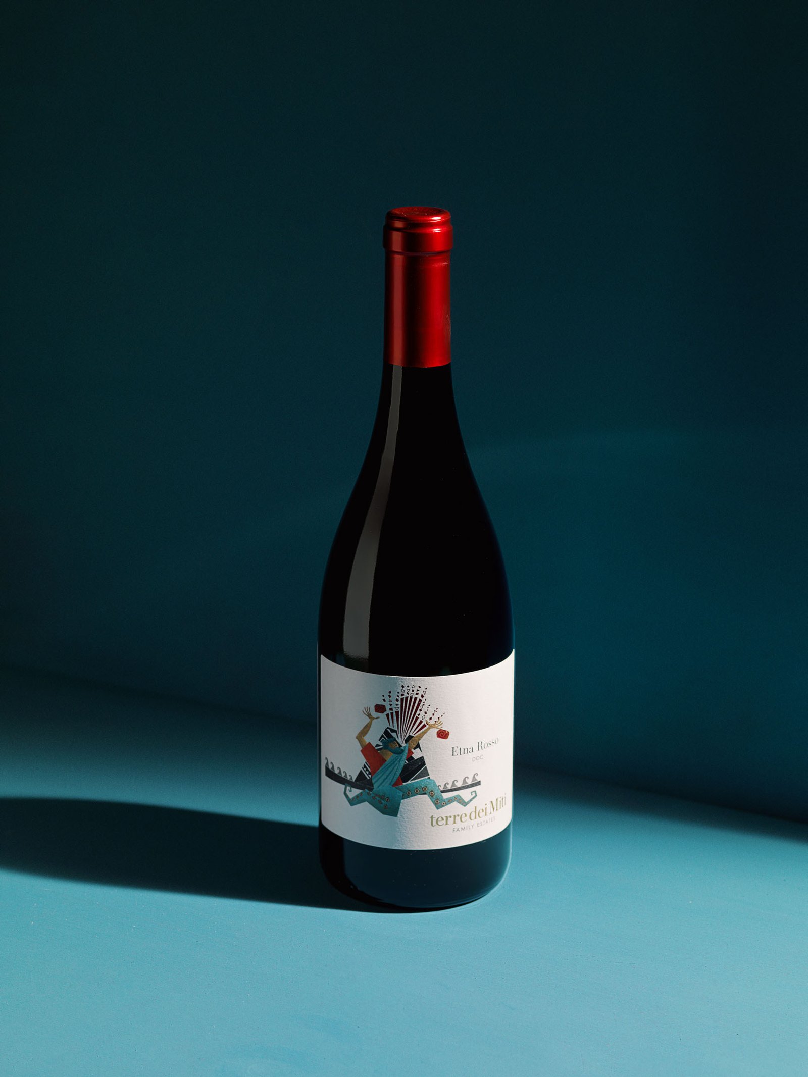
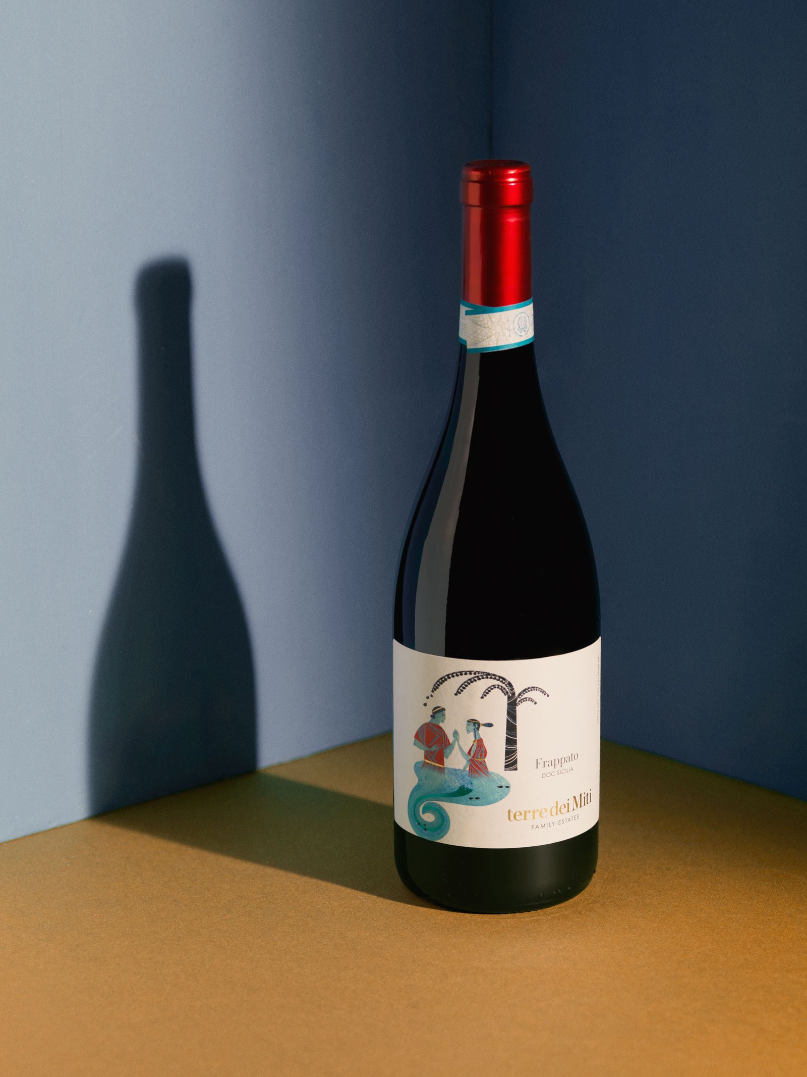
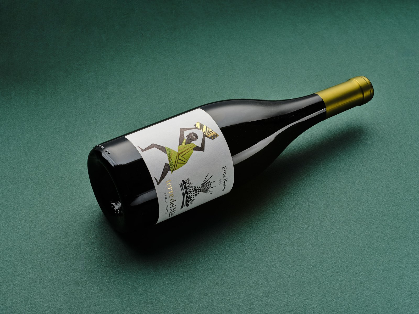
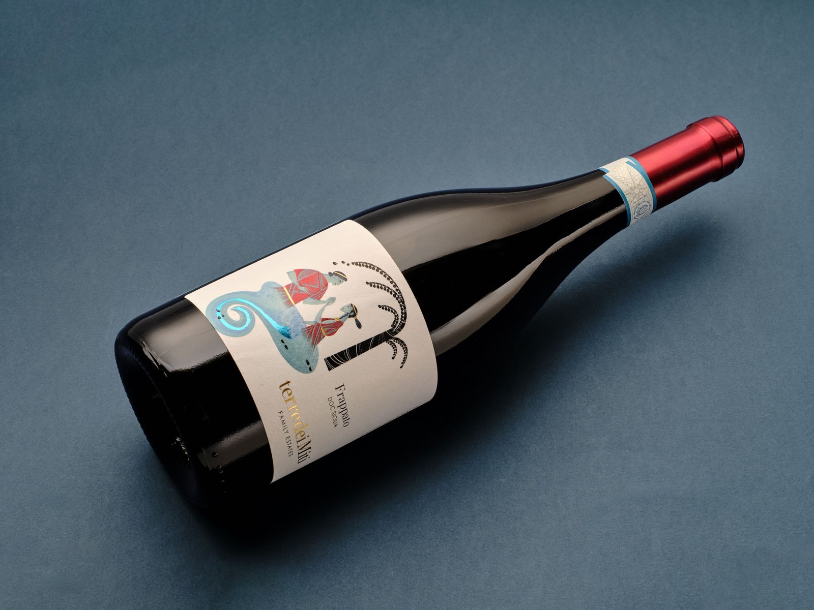
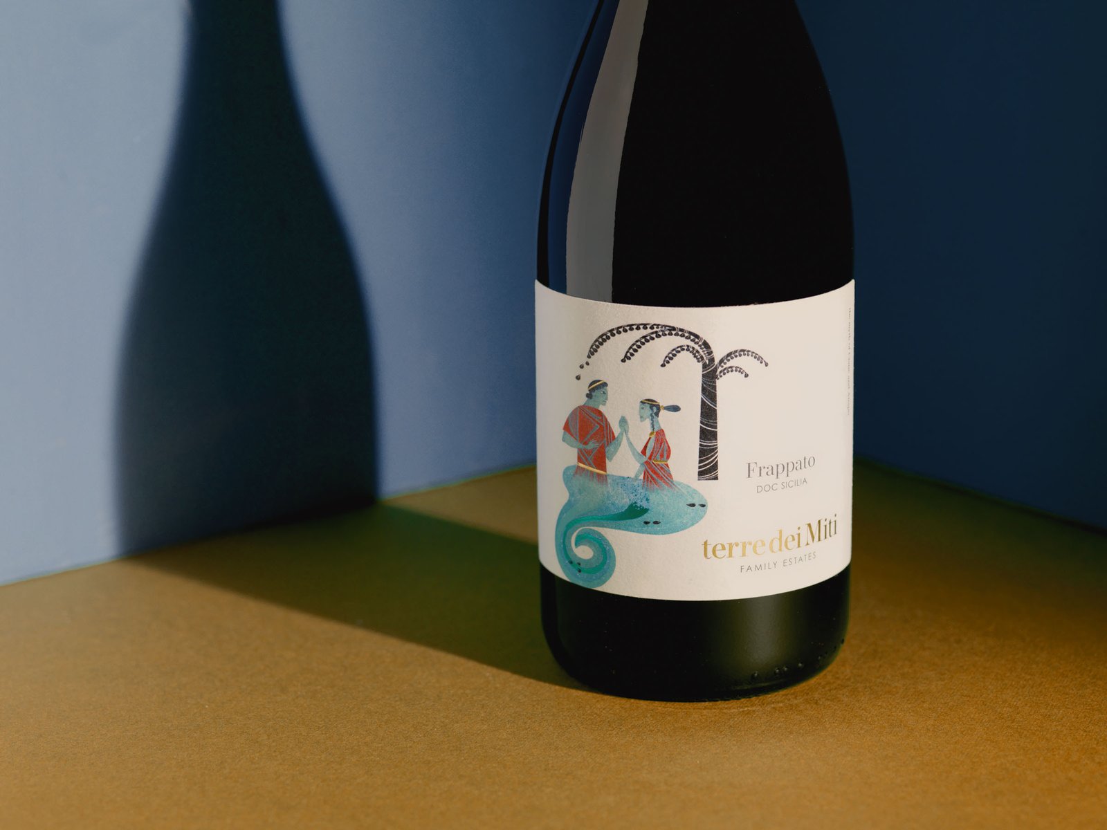
Sicilian winery, Terre dei Miti Family Estates: Etna Bianco, Etna Rosso and Frappato. Each label tells a myth — Polyphemus for the white, Enceladus for the Etna Rosso, Ciane and Anapo for the Frappato — in a design by AD Positive with illustrations by Martina Peluso. We photographed them twice, in 2024 and 2025, with Leonardo Recalcati as creative director.
- Project
- Terre dei Miti
- Sector
- Wine & spirits
- Year
- 2024–2025
- With
- Creative direction: Leonardo Recalcati · Graphic design: AD Positive · Illustrations: Martina Peluso
- Services
- Packshot & packaging · Advertising & catalogues
The brief
Two commissions nine months apart, for the same line of three wines, both with Leonardo Recalcati as creative director, which means with the studio that designed the labels. The first, in August 2024: the bottles, the labels up close, the capsules. The second, in May 2025: the same bottles inside a scene, with a colour and a light that tell a story. Two different ways of looking at the same project, and today both are in the AD Positive portfolio.
The constraint
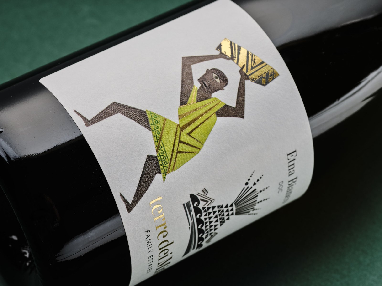
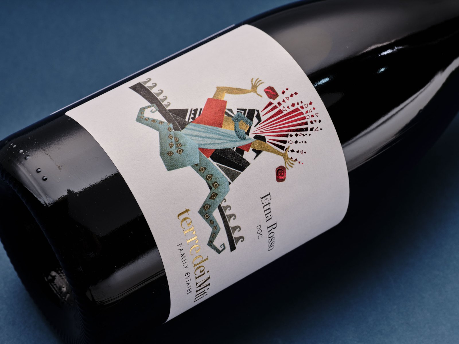
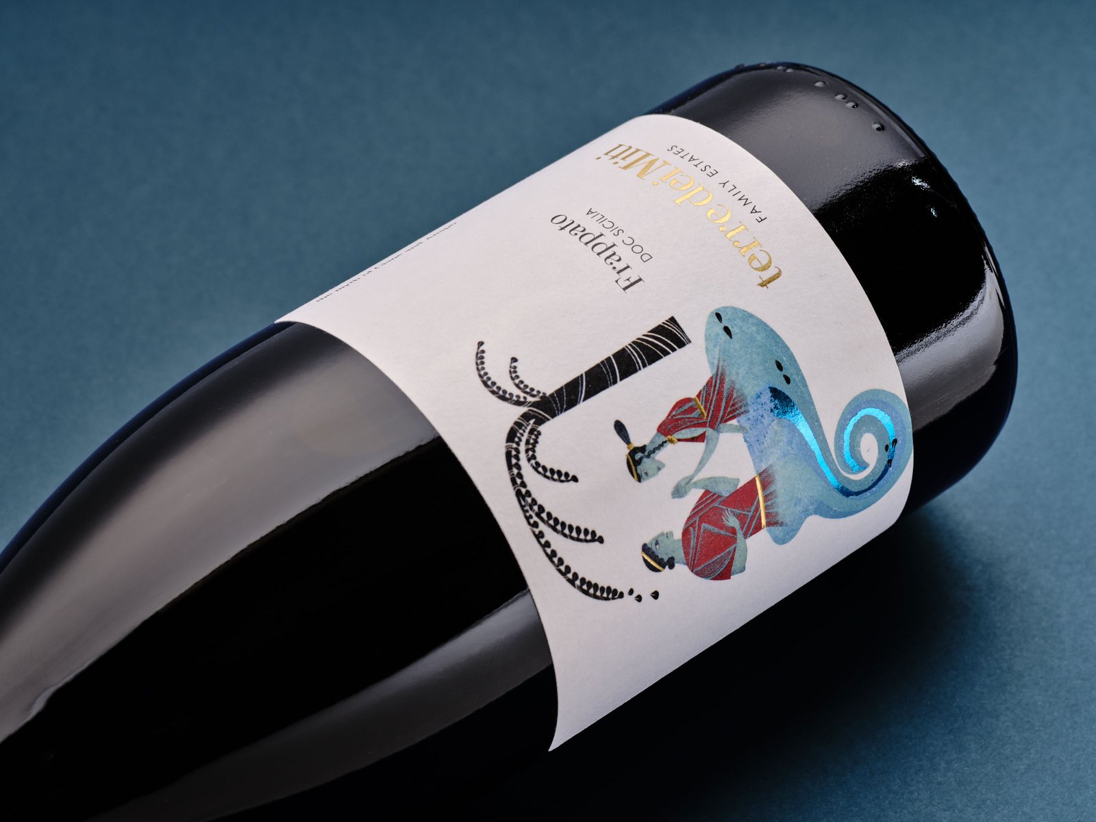
Each label carries a figure from the myth, and inside each figure there is a part that shines: the gold rock Polyphemus lifts above his head, the red shards bursting from the hands of Enceladus, the blue wave Ciane and Anapo stand on. They are the heart of the story, and in a photograph they are the hardest thing of all, because a metallic surface has no colour of its own: it gives back whatever is in front of it. Caught badly, the gold rock turns grey and the blue wave turns black. Around them is a white paper with its own texture, which burns out under light in an instant, and beneath the label a dark, glossy bottle that reflects the whole studio.
How we solved it
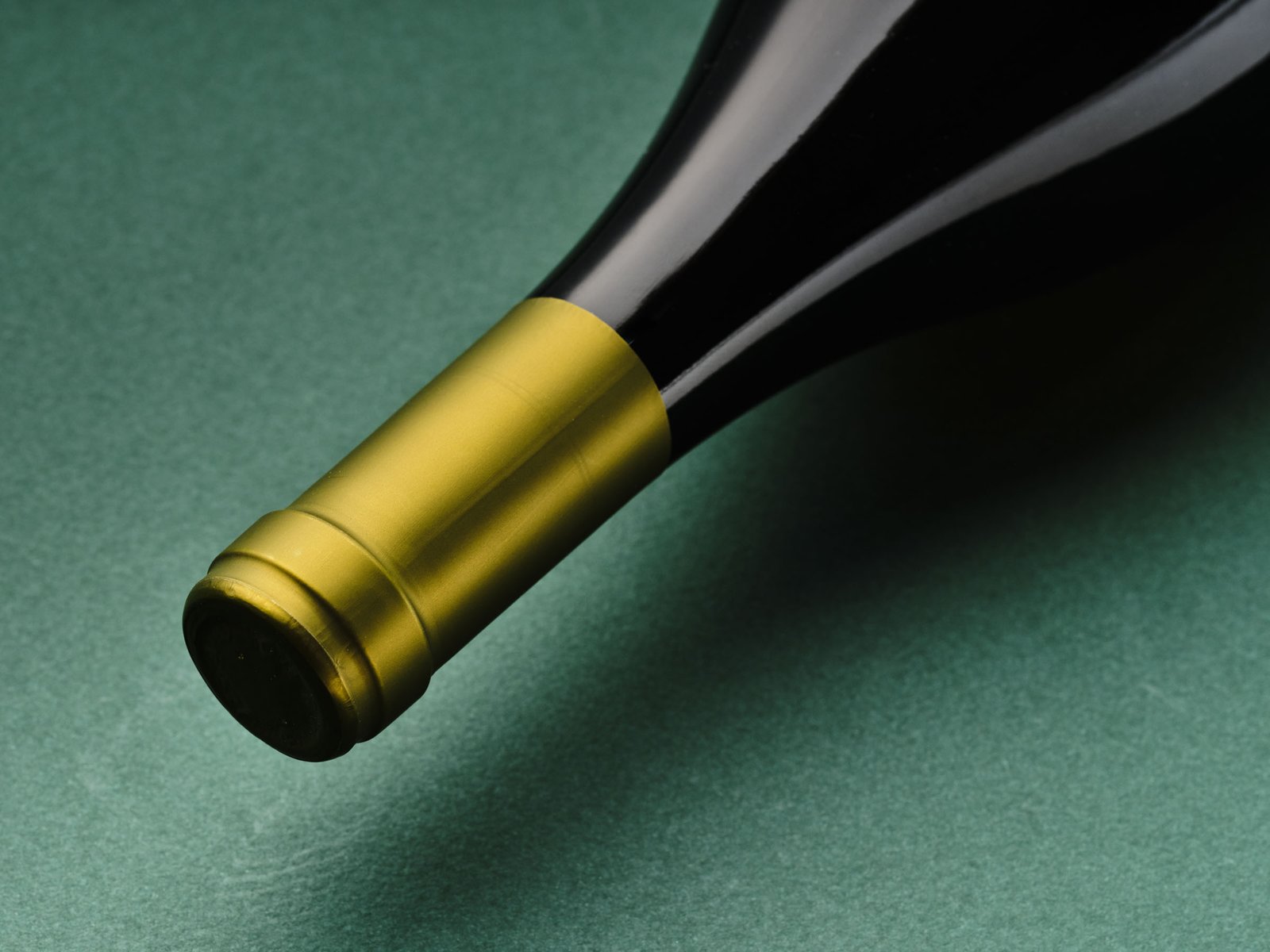
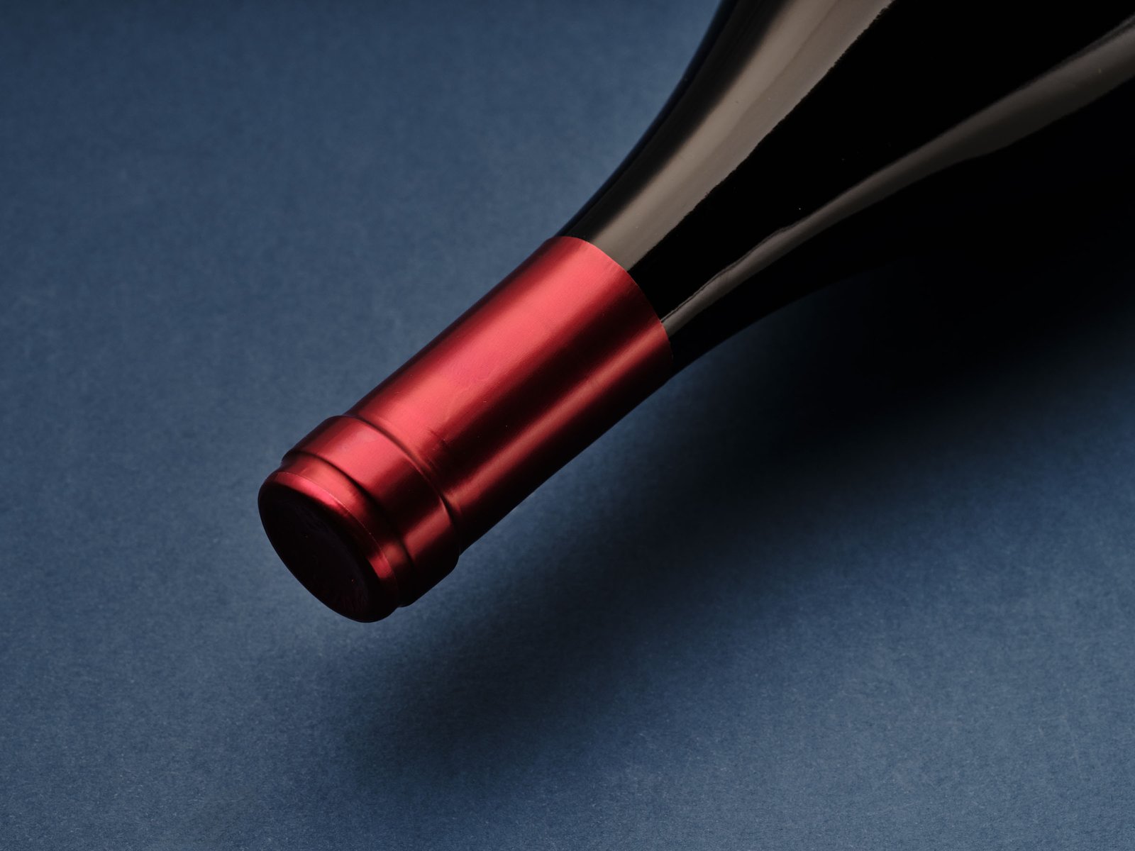
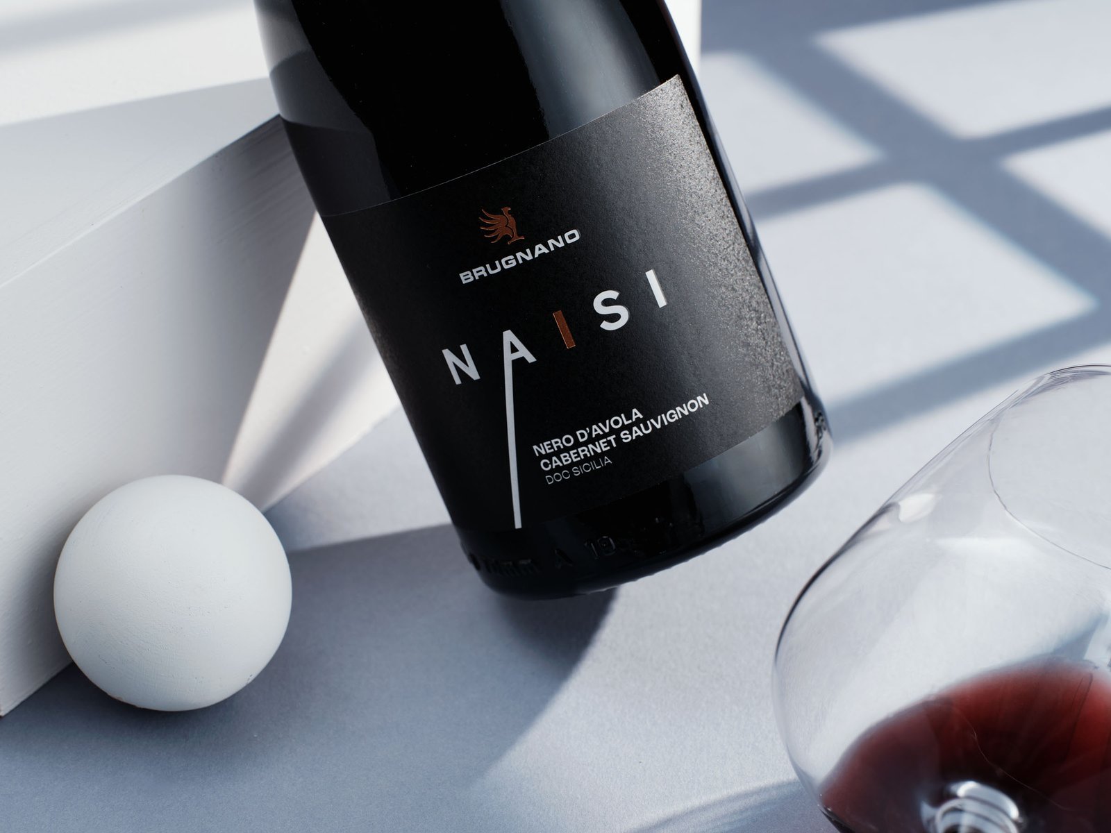
In the first set the bottles lie down, so the label stays flat in front of the lens and the figure reads without distortion. The light is soft and broad: a metallic surface reflects the light in front of it, and if that light is large the gold stays gold from edge to edge and the blue stays blue. The background is coloured paper, green for the Etna Bianco and blue for the two reds, and the capsule — gold on the white, red on the reds — sits on it like another block of colour. Then the details, up close, one per myth. In the second set the bottles stand up and the wine steps into a scene: walls and floors in solid colours, blue, green, teal, ochre, and a hard, sun-like light that throws the bottle's silhouette onto the wall. The shadow becomes the second figure in the picture, as sharp as the outlines of the figures on the labels. A thread runs between the two sets: the green and blue of the papers in the first come back in the walls and floors of the second.
What we delivered
- 2024: the bottles lying on coloured paper, green for the Etna Bianco and blue for the reds
- 2024: the labels up close, one figure per wine, and the capsules
- 2025: the three bottles standing in a set of coloured walls, with hard light and a long shadow
- 2025: the label in the same light, up close
- Landscape and portrait frames, for both series
Where the images ended up
- AD Positive portfolio